& Ditto
Goodside is an independent brand design studio creating identities for the products, places, and experiences people fall in love with.
For business inquiries,
collaborations or hellos
Follow along
Instagram LinkedIn X (Twitter) Substack
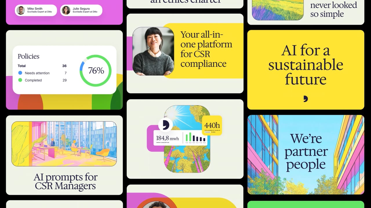
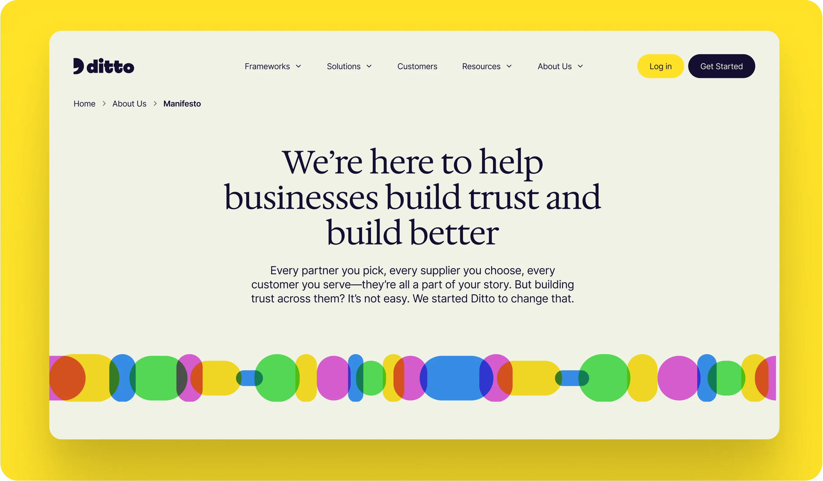
At its core, Ditto is a story about partnership. It’s about building trust between companies and proving to your partners that your sustainability practices measure up. Our strategy positioned Ditto as a compliance copilot: one part trusty sidekick, one part whoa-that-was-magic assistant. The name Ditto reinforces this idea of partnership in the simplest, most human way. A conversational shorthand that means “same here,” Ditto signals alignment, reciprocity, and trust, helping businesses communicate to one another, “we’re on the same page.”
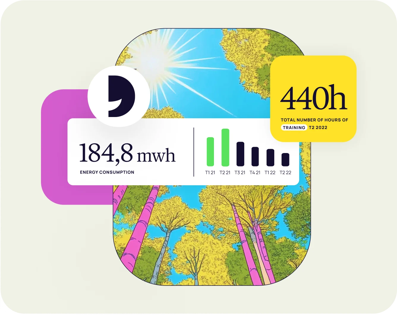
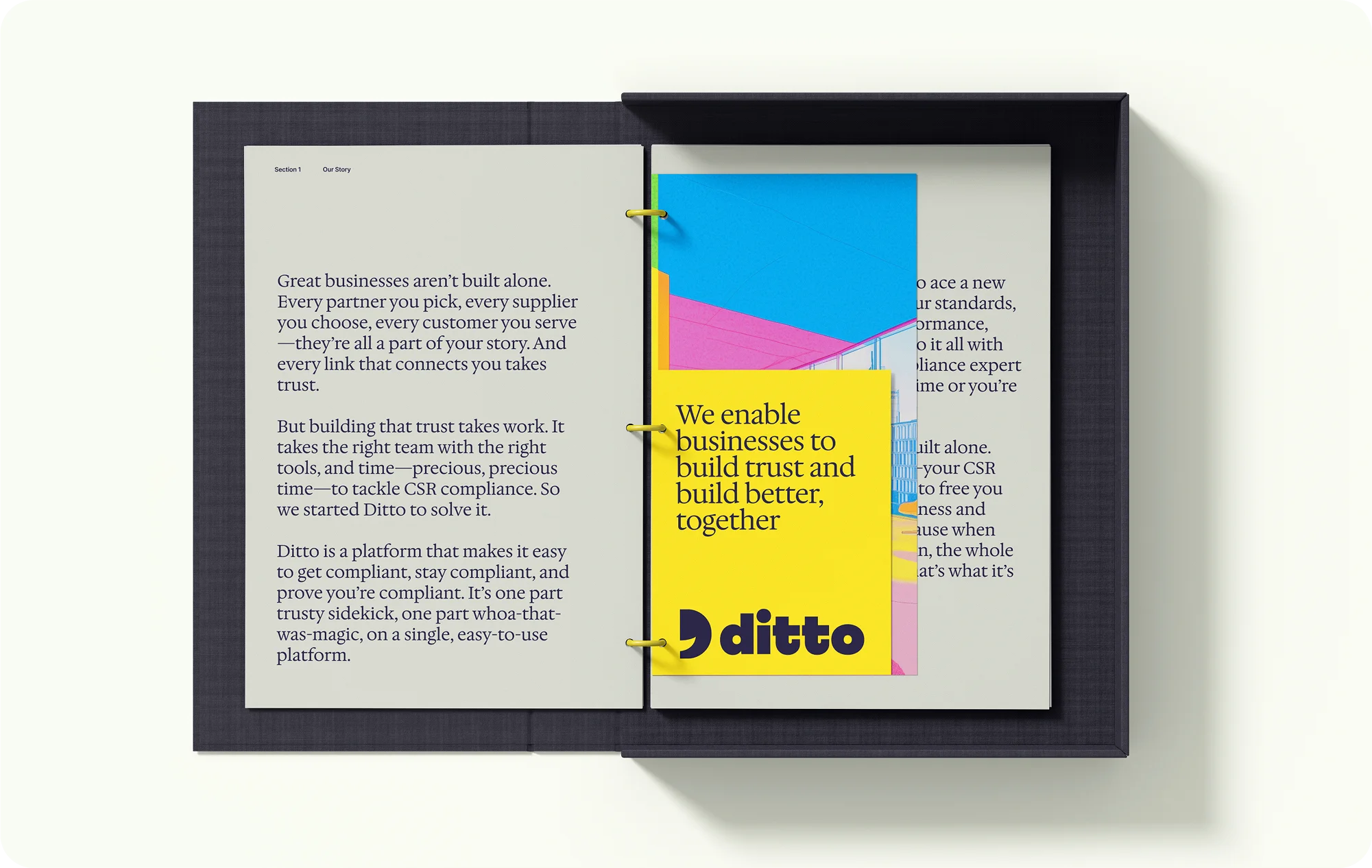

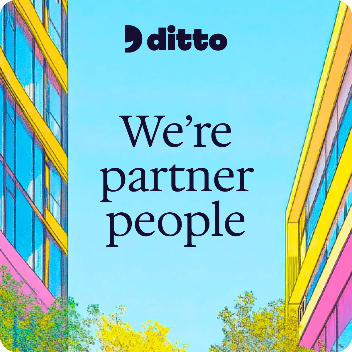
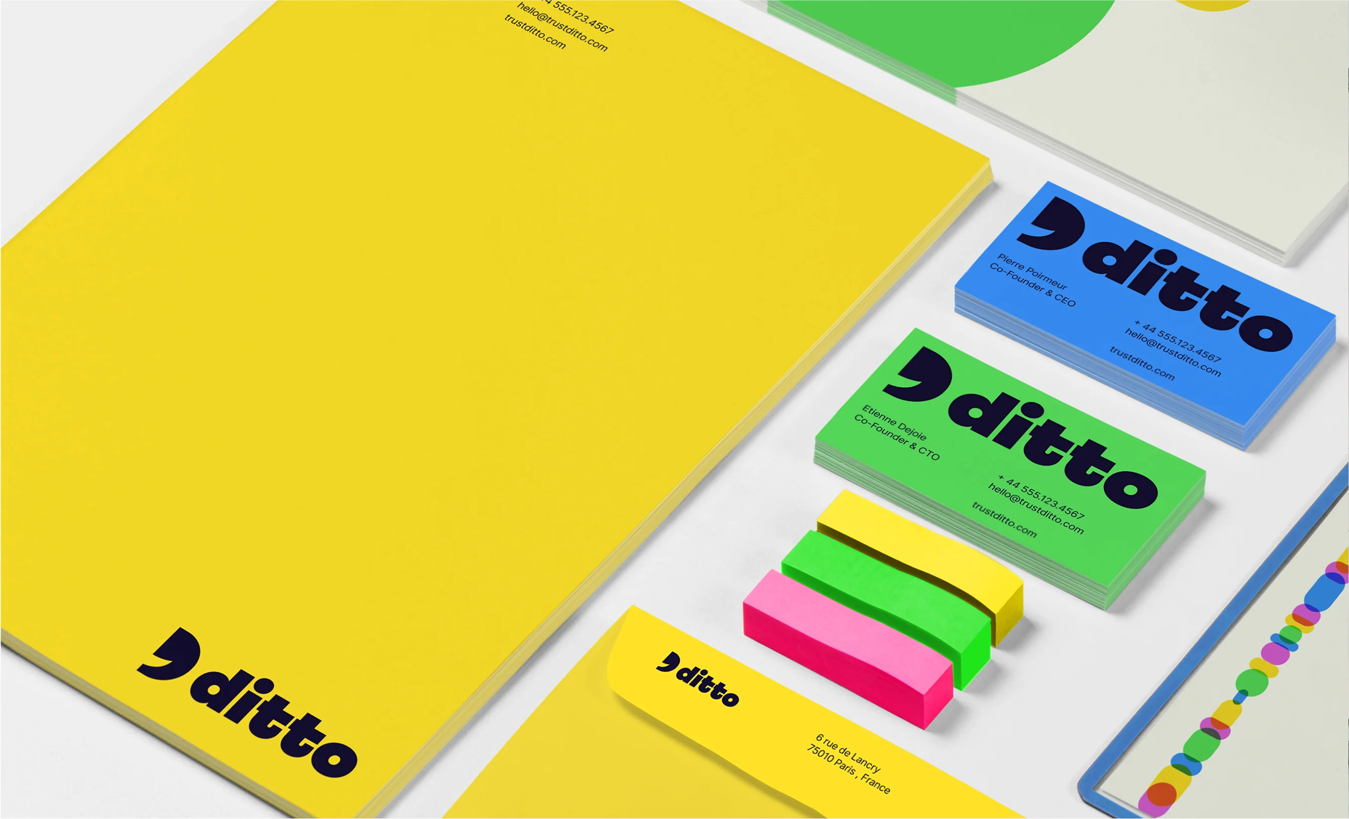
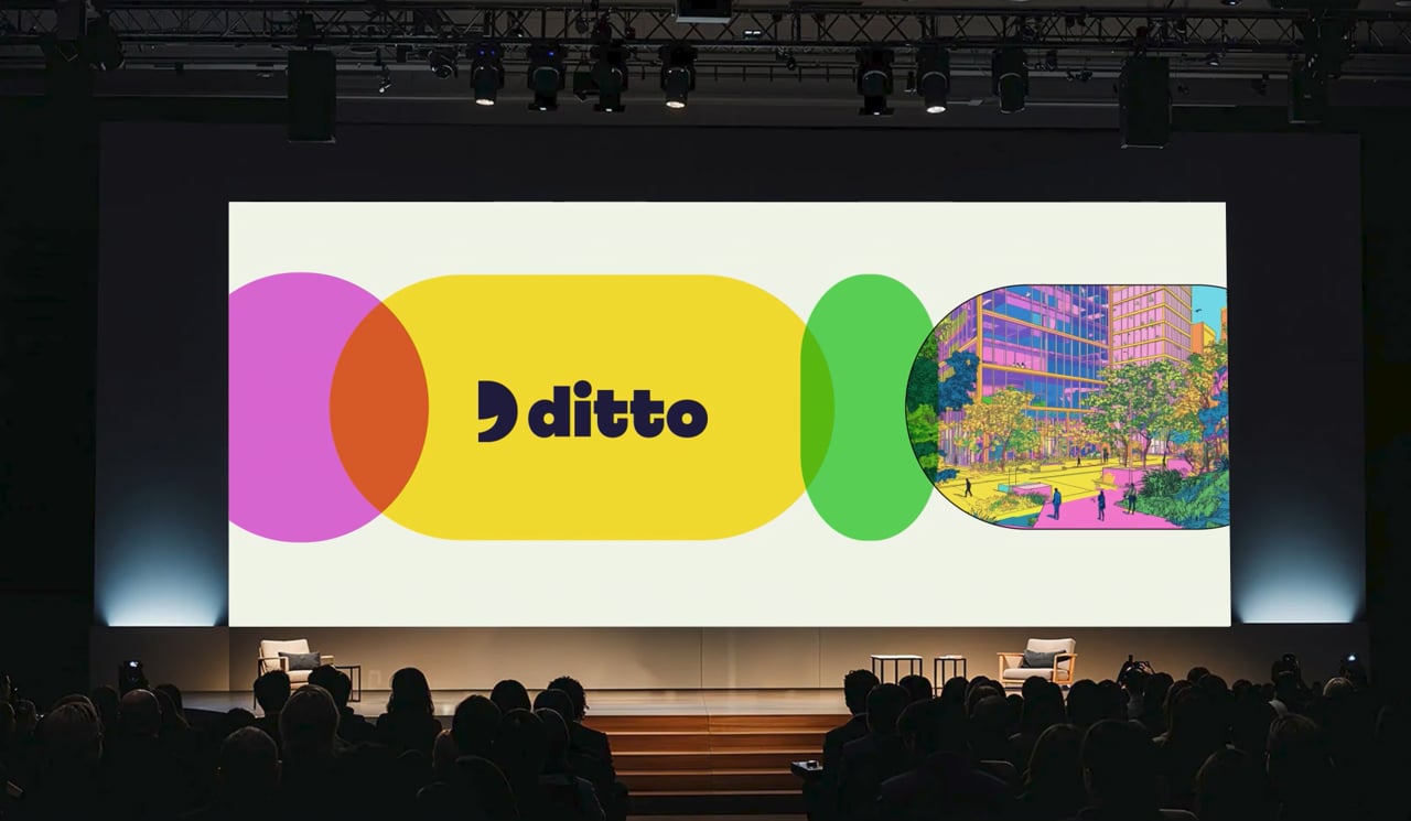
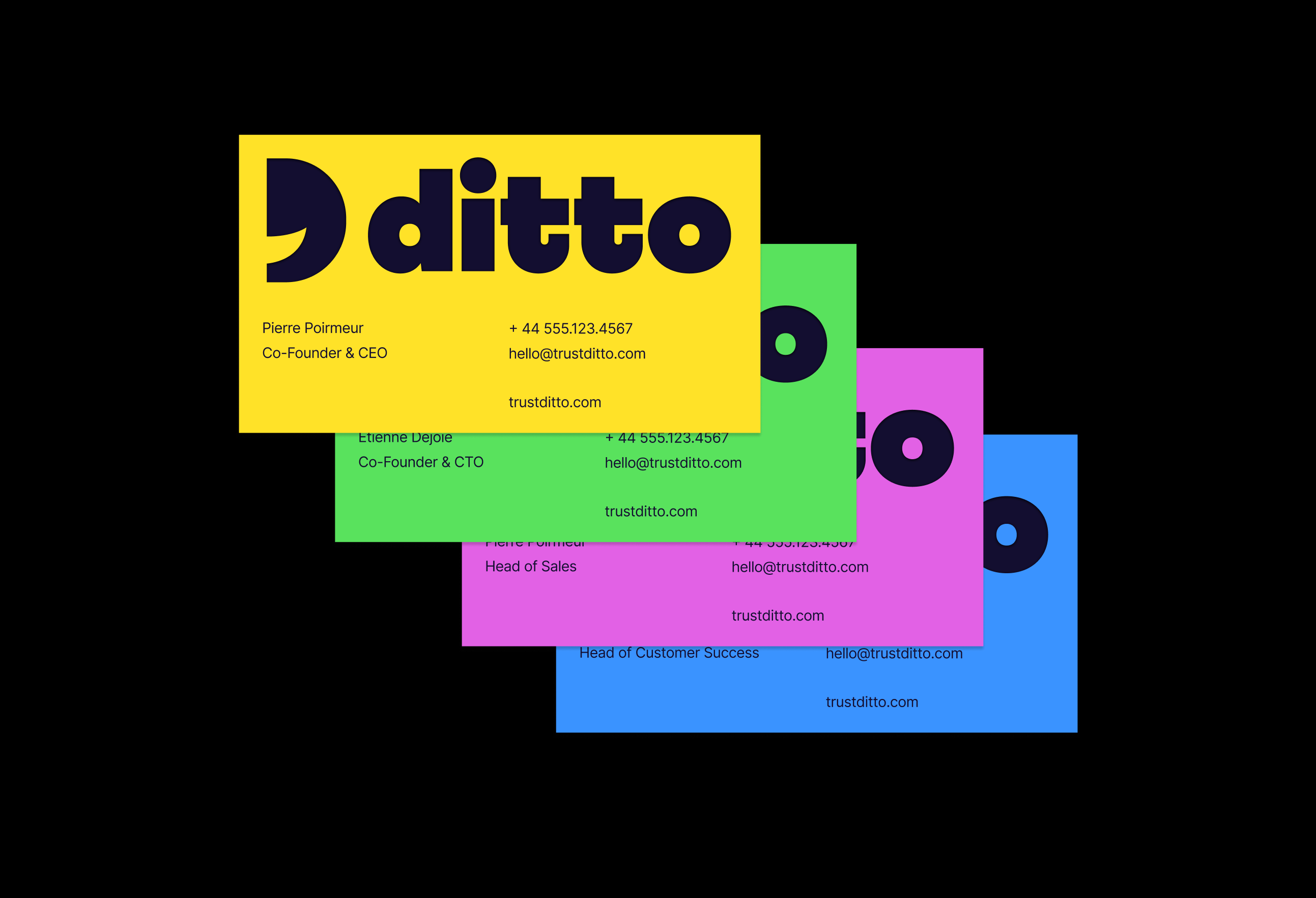
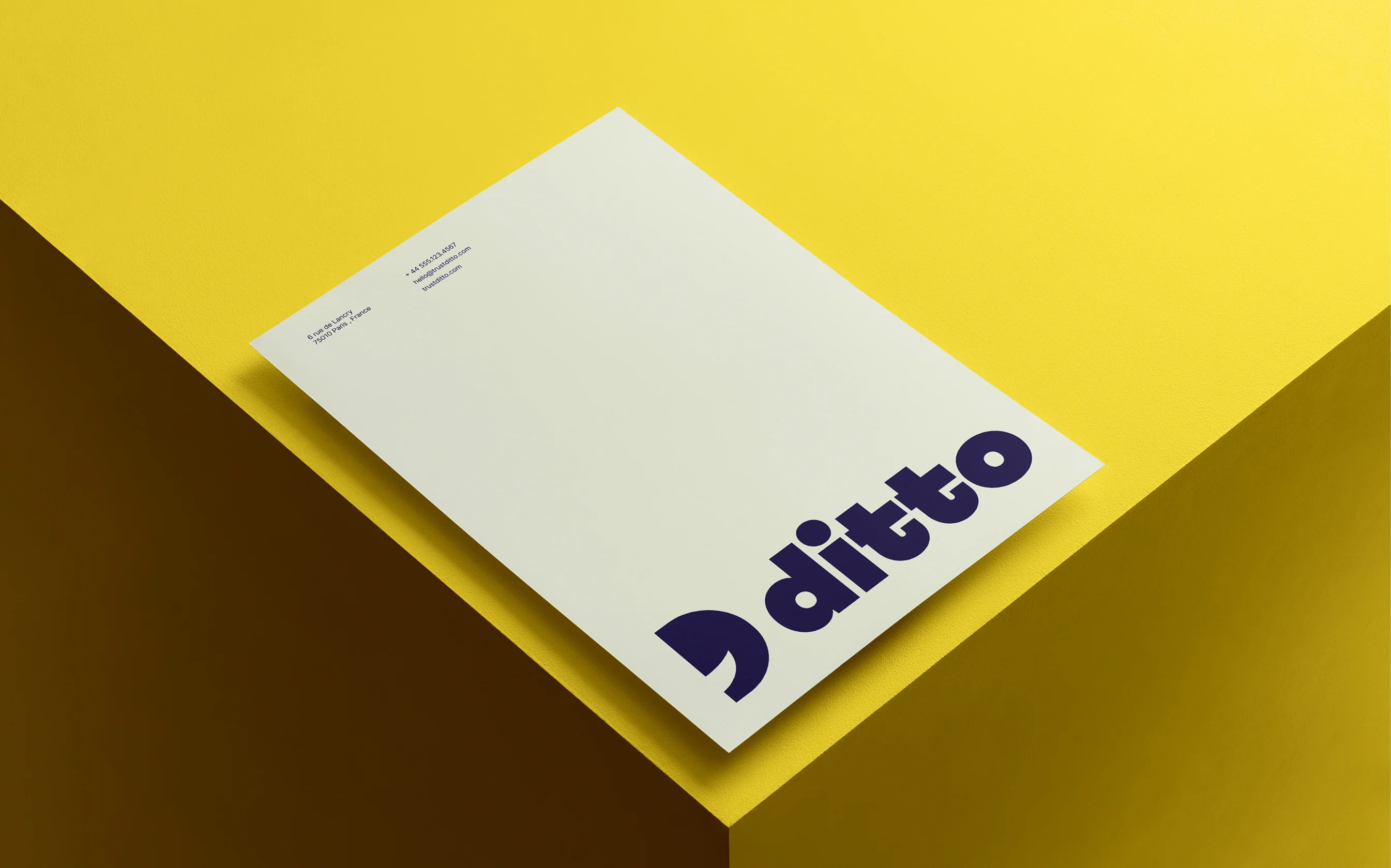
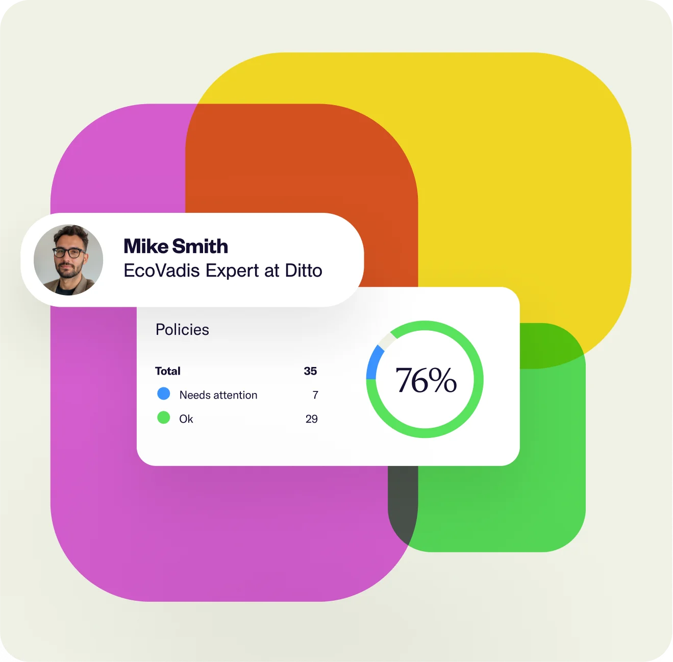
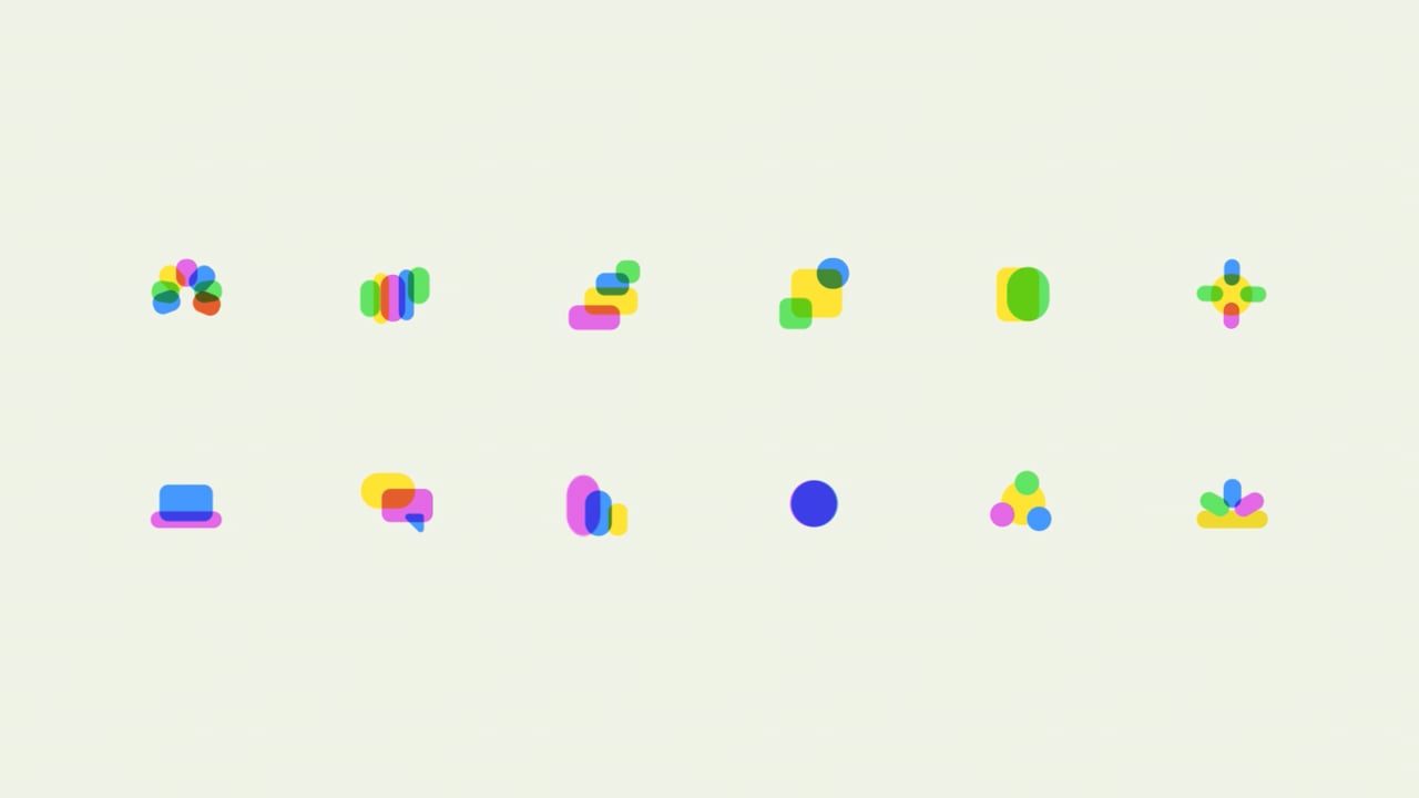
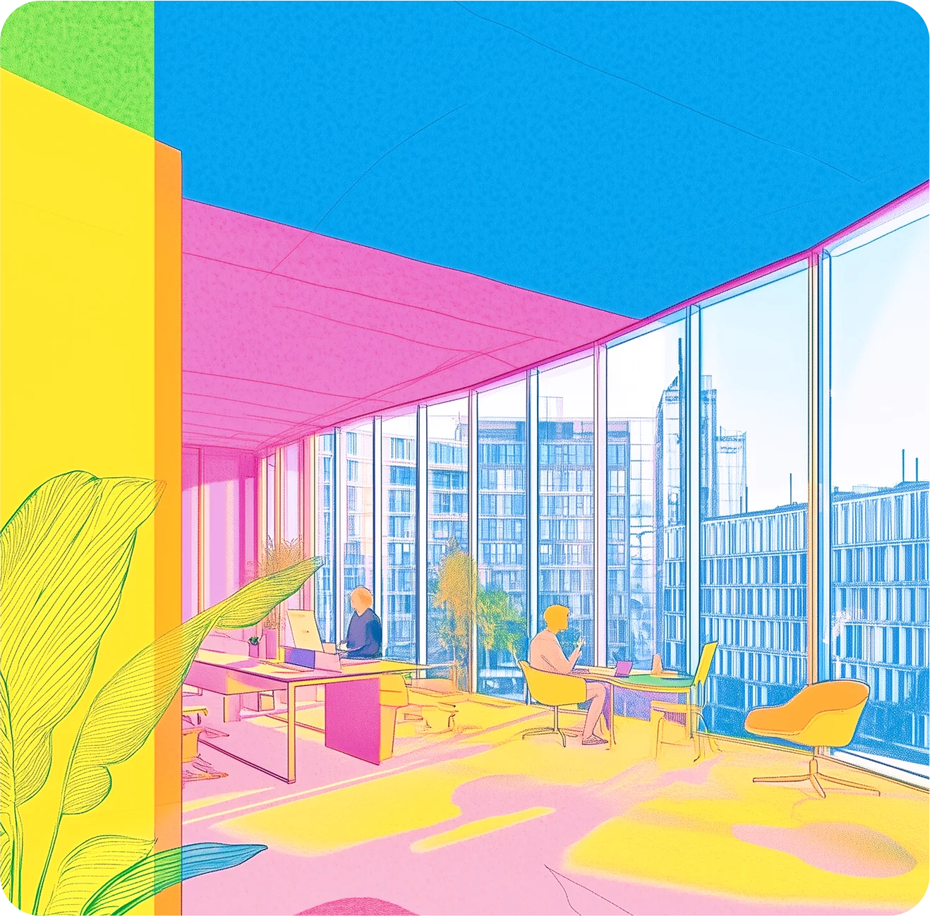
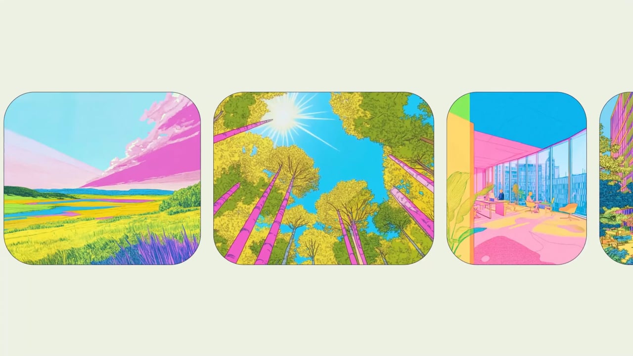
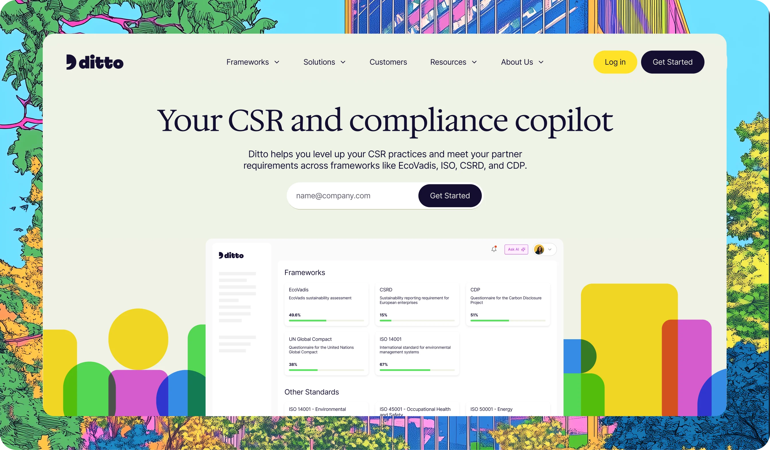
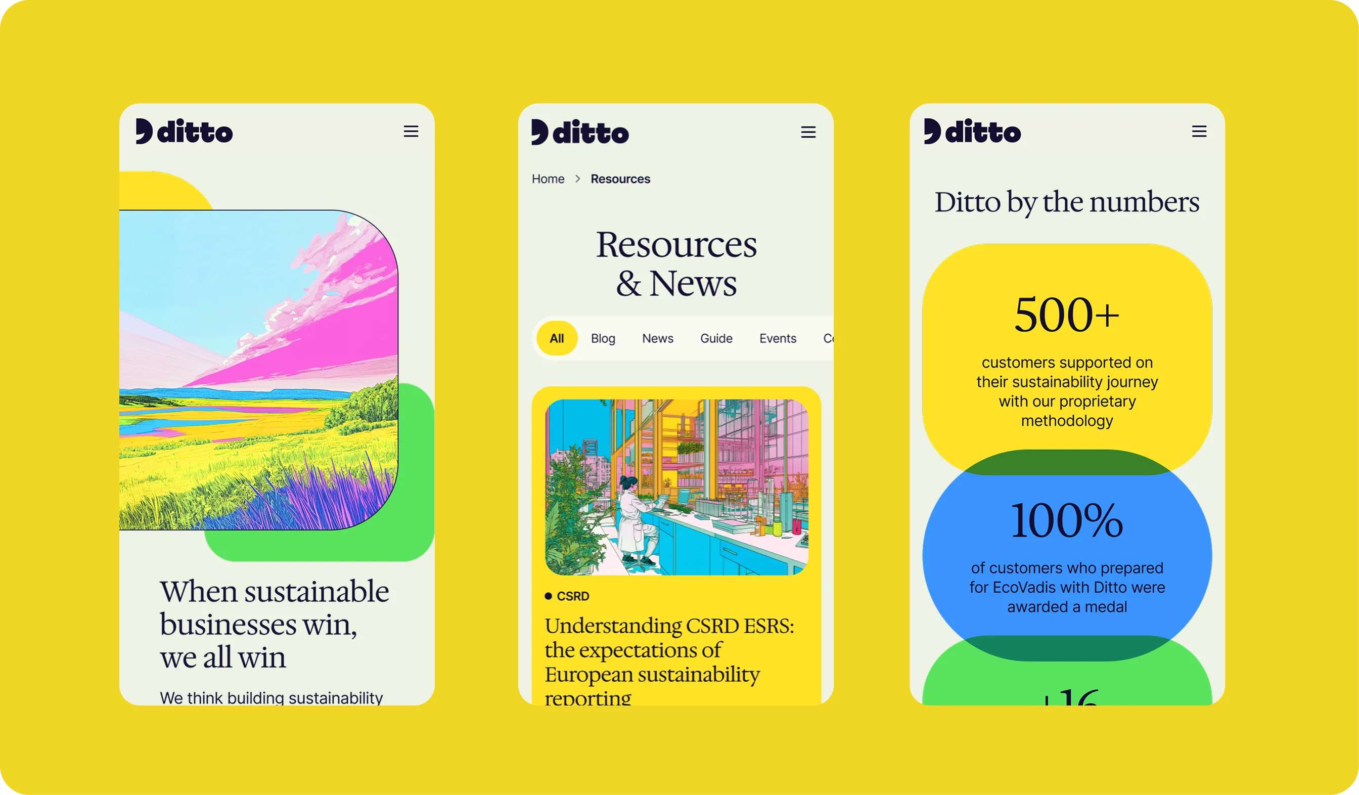
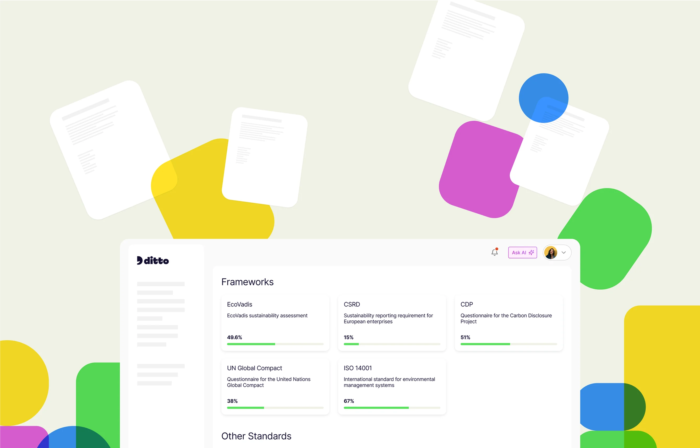
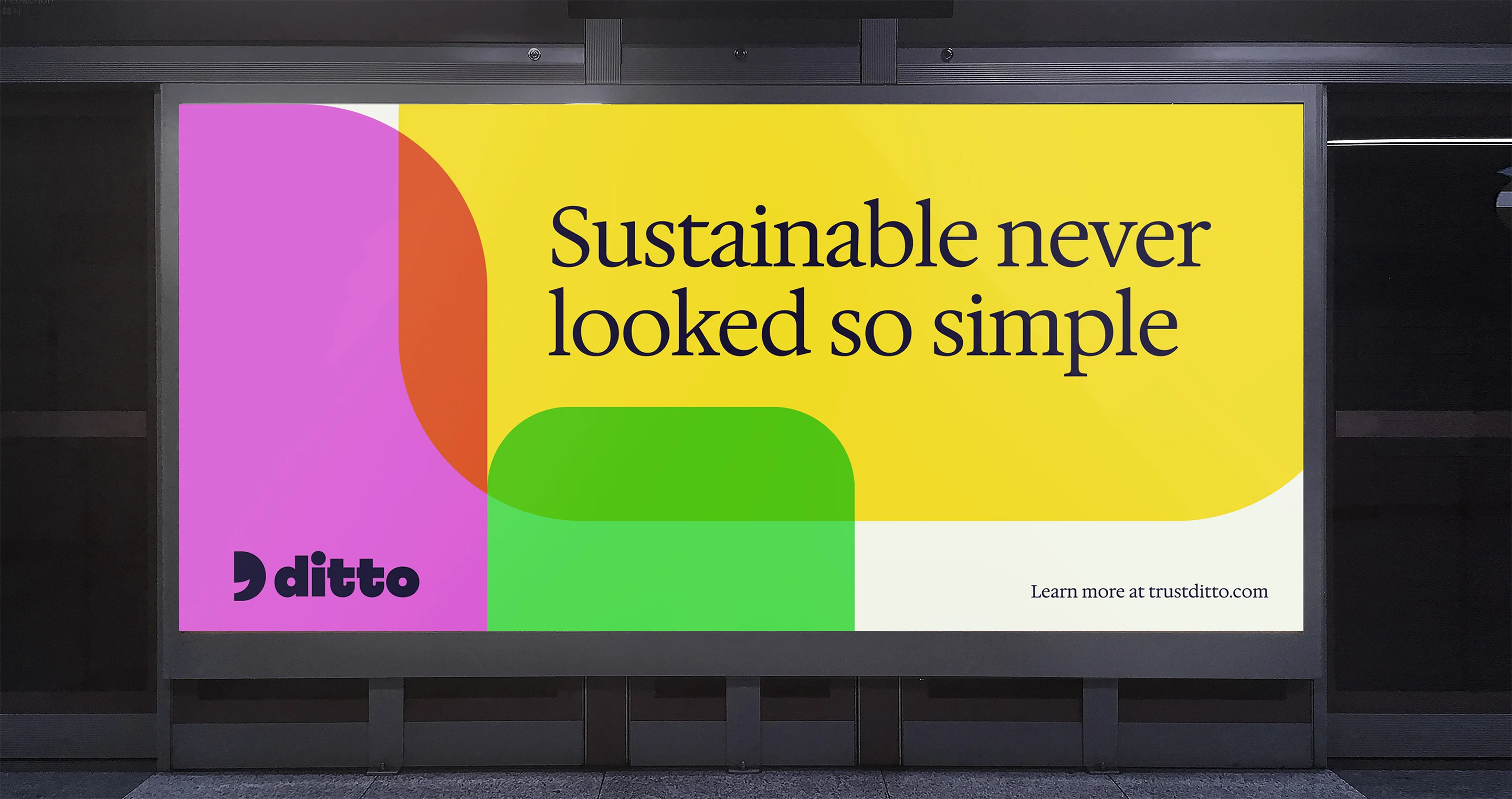
Ditto’s identity is, in a single word, delightful. A smiling logo mark, a vibrant, rainbow color palette—who said B2B SaaS brands have to play it safe? We anchored the design system with a shape-linking brand language as a nod to the partnerships Ditto facilitates and developed an illustration style that envisions the vibrant, sustainable worlds it makes possible. We pulled it all together with a joyfully supportive brand voice and a balanced type system that feels expert, yet approachable and warm.