& Puck
Goodside is an independent brand design studio creating identities for the products, places, and experiences people fall in love with.
For business inquiries,
collaborations or hellos
Follow along
Instagram LinkedIn X (Twitter) Substack
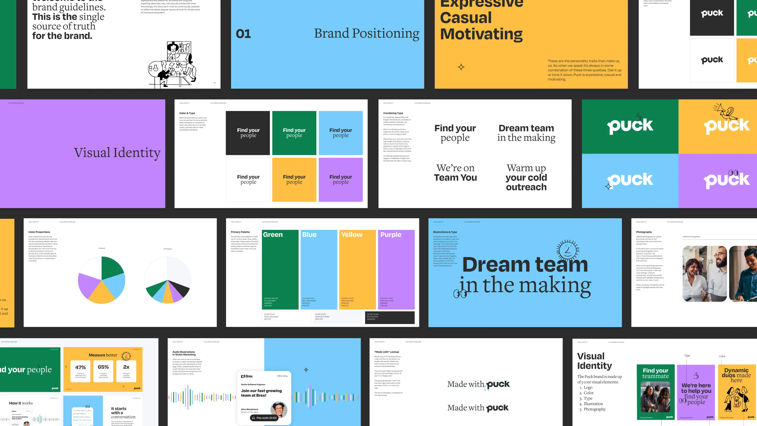
Puck came to us with a clear sense of purpose, so it wasn’t long before we arrived at the insight: finding the right job for you isn’t about the job—it’s about you. Our brand idea, find your people, captures this concept, celebrating the individuality that exists behind every job rec and resume, and the people that make a workplace what it is.

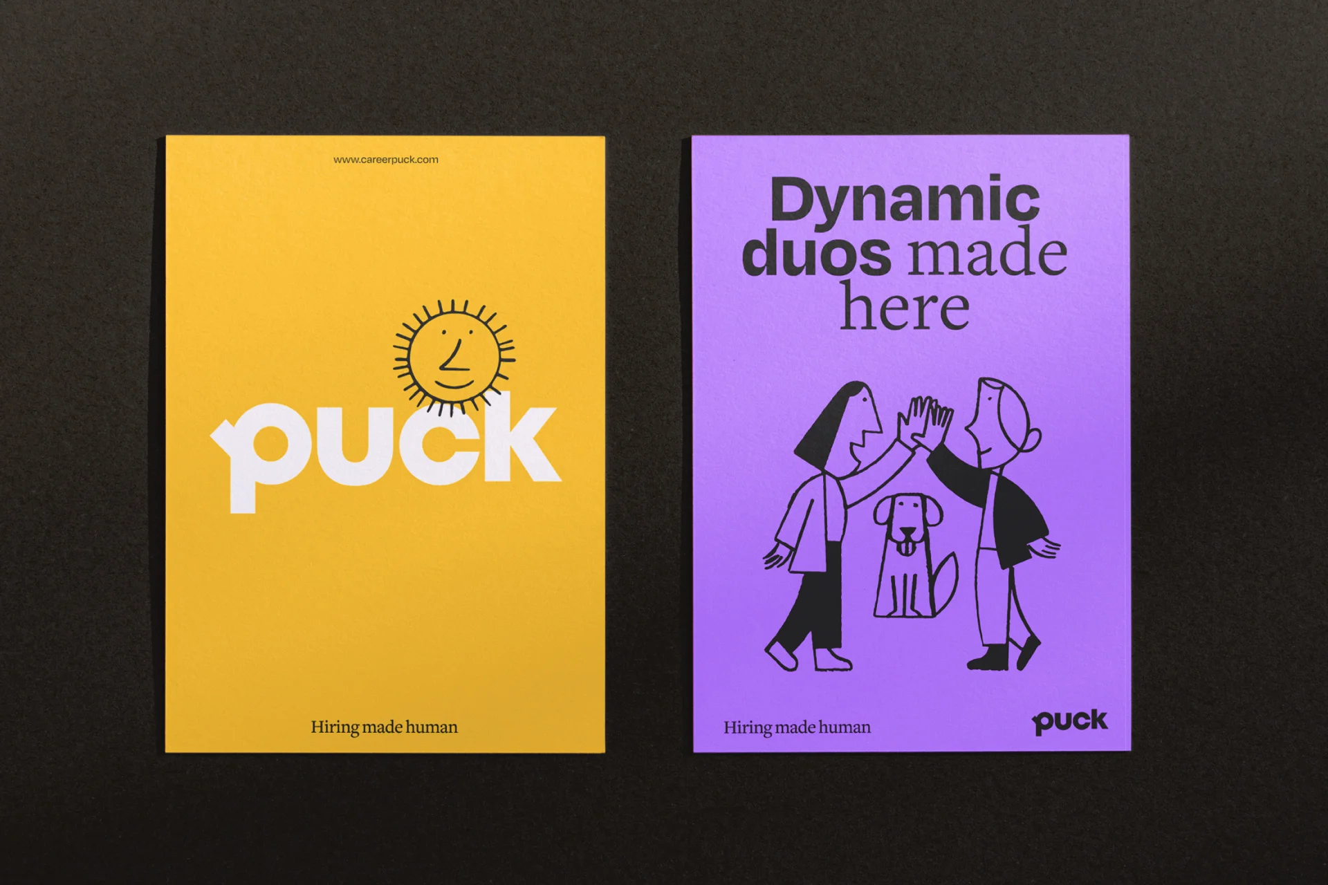
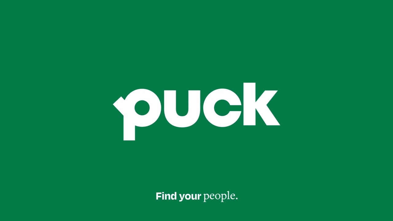
Puck’s new, custom wordmark consists of a friendly sans serif with rounded letterforms. The unique “p” is designed to reference a magnifying glass, a nod to the search for the perfect team or candidate. Animation and illustration transform the mark into a playful stage, making space for delightful interaction.



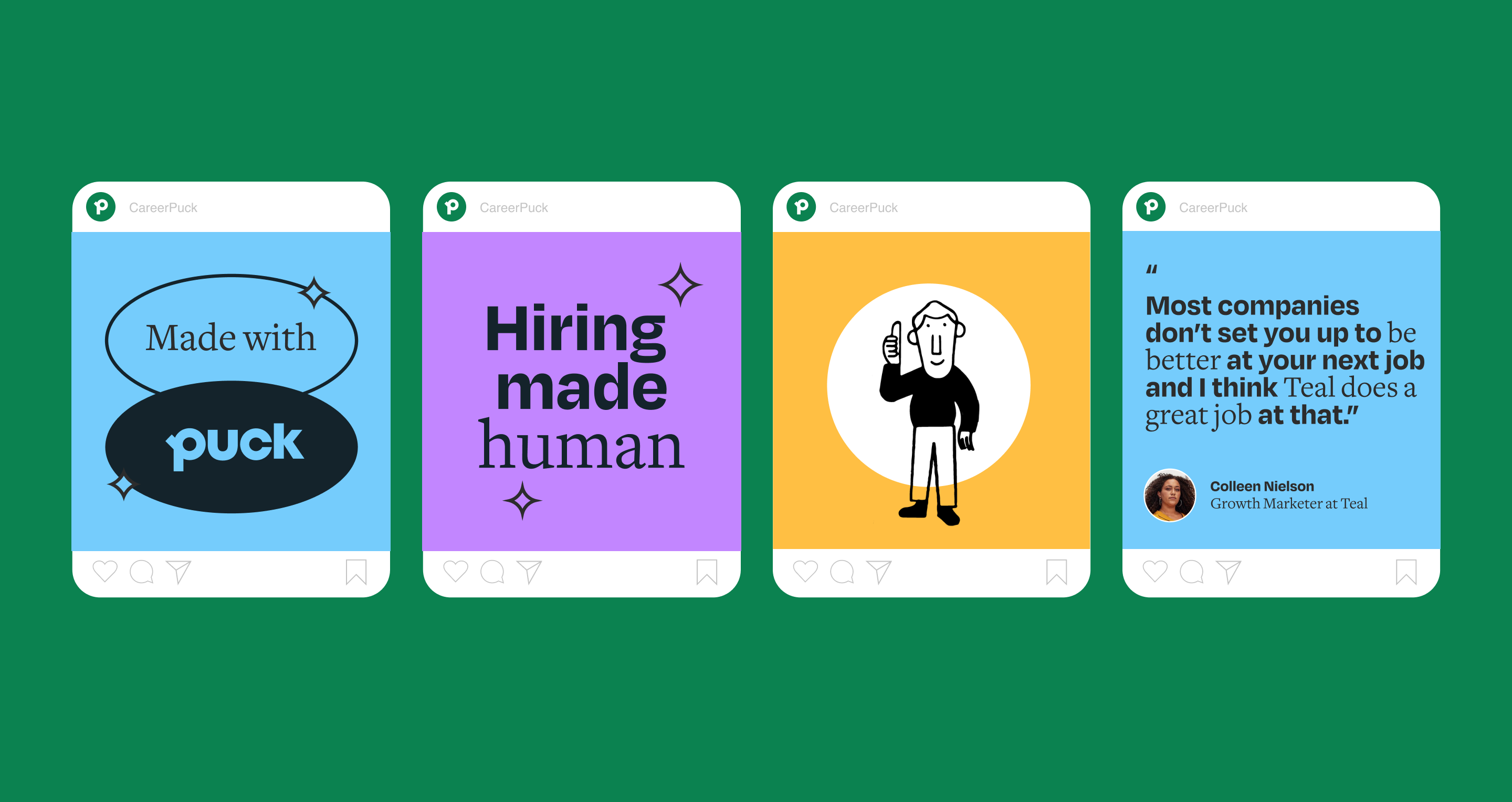
We wanted to give Puck a brand voice that felt warm and inviting, with just a hint of cheekiness. By being expressive with our brand personality and voice, our hope is that we empower the people who use Puck to do the same, bringing authenticity to every interaction.

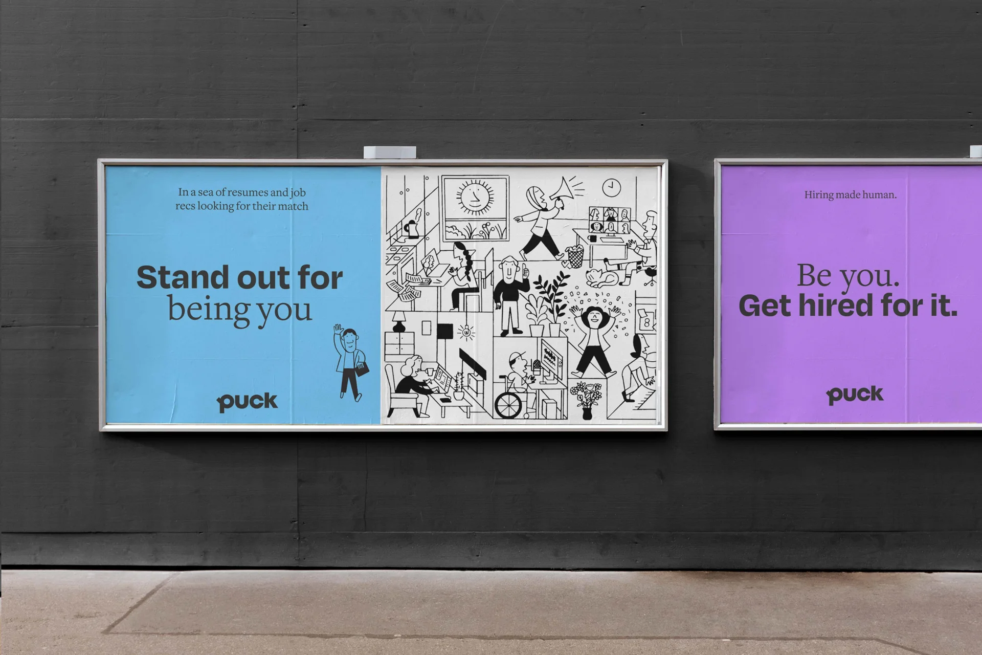
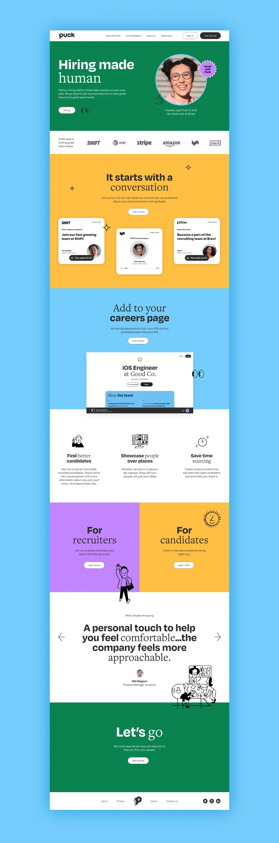
Once the foundational brand positioning and logo were established, we created a robust visual brand system with bright colors, bold type, and crisp, clean layouts. Hand-drawn illustrations by Jay Cover bring the whole system together, playfully interacting with photography and type in unexpected ways.