& Spero Ventures
Goodside is an independent brand design studio creating identities for the products, places, and experiences people fall in love with.
For business inquiries,
collaborations or hellos
Follow along
Instagram LinkedIn X (Twitter) Substack
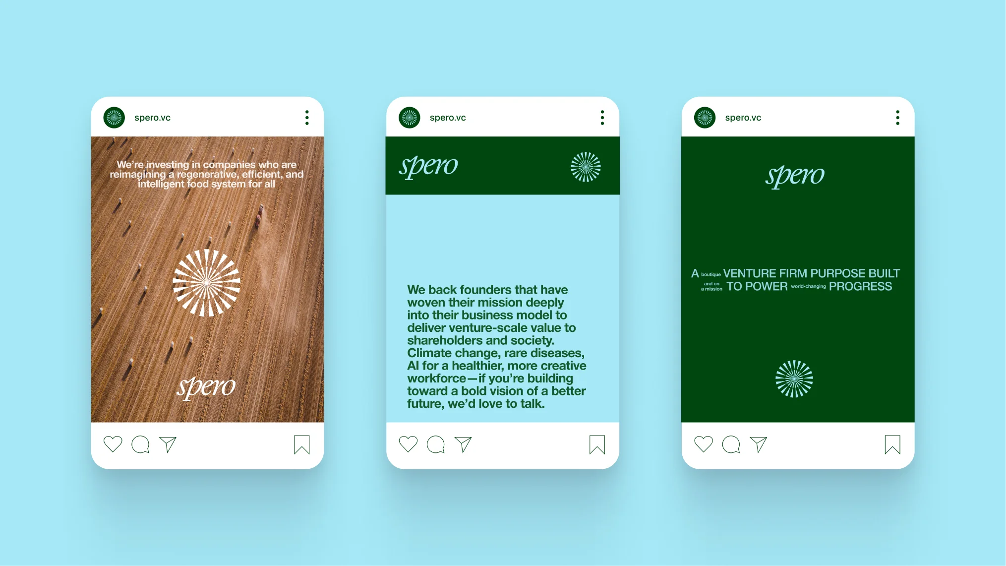
In our early conversations, we learned that for Spero, the focus on mission isn’t just about the big picture. That’s simply the starting point. Instead, it’s the daily, focused execution that makes their portfolio companies successful and where their partnership really lives. Our core brand strategy was built around this big-picture, daily-practice dynamic: turning purpose into progress.
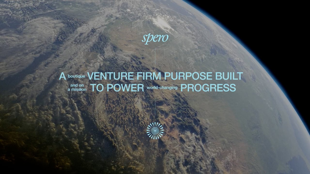
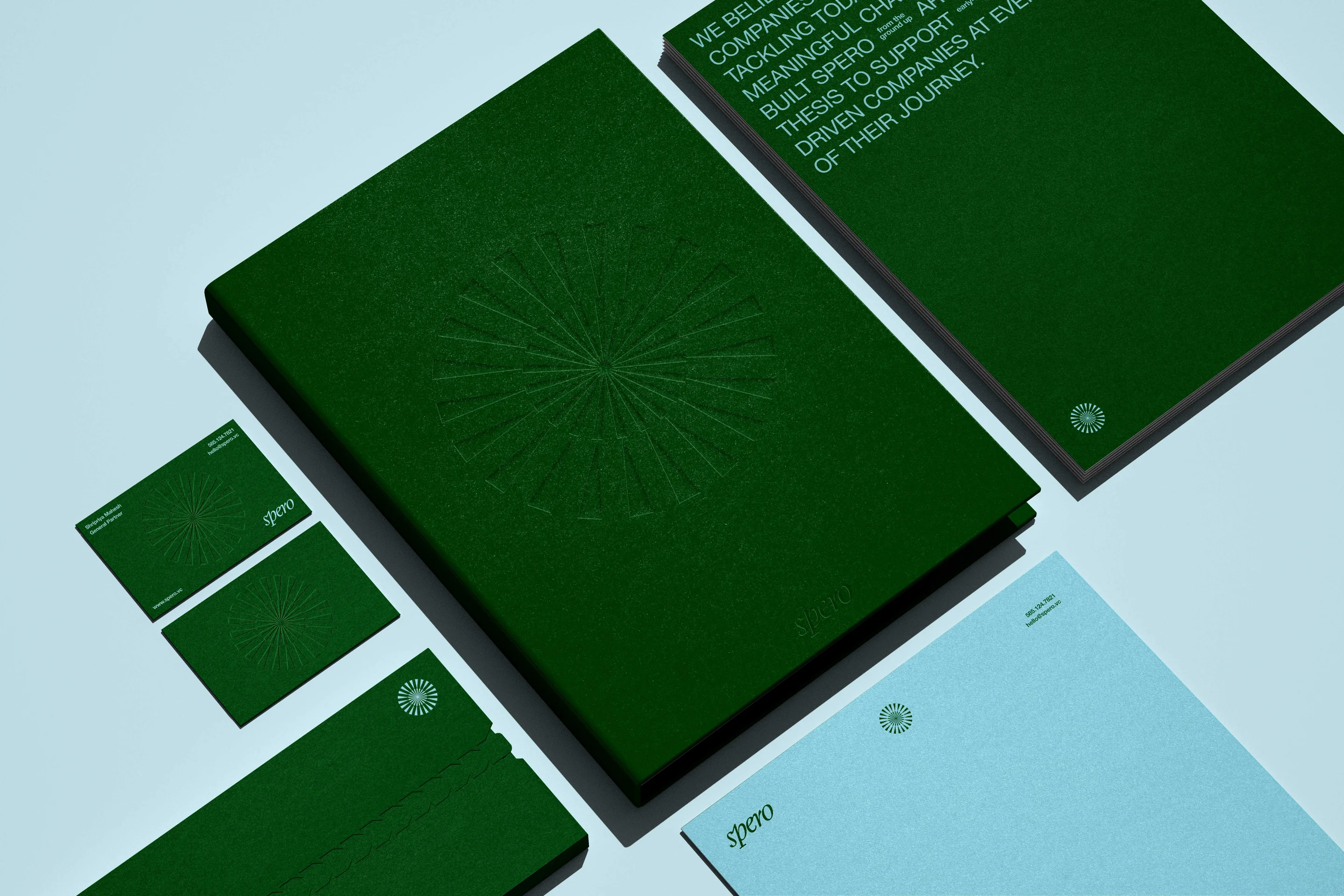
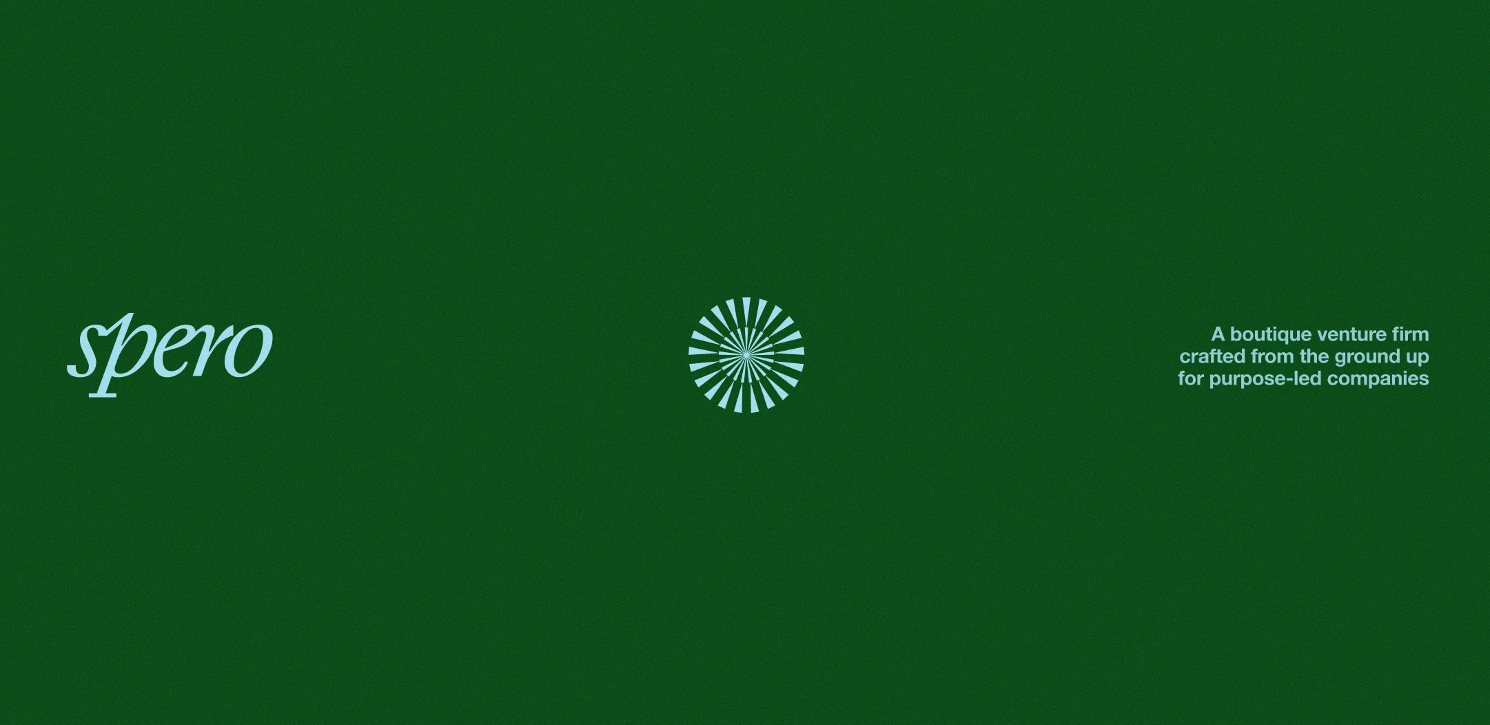

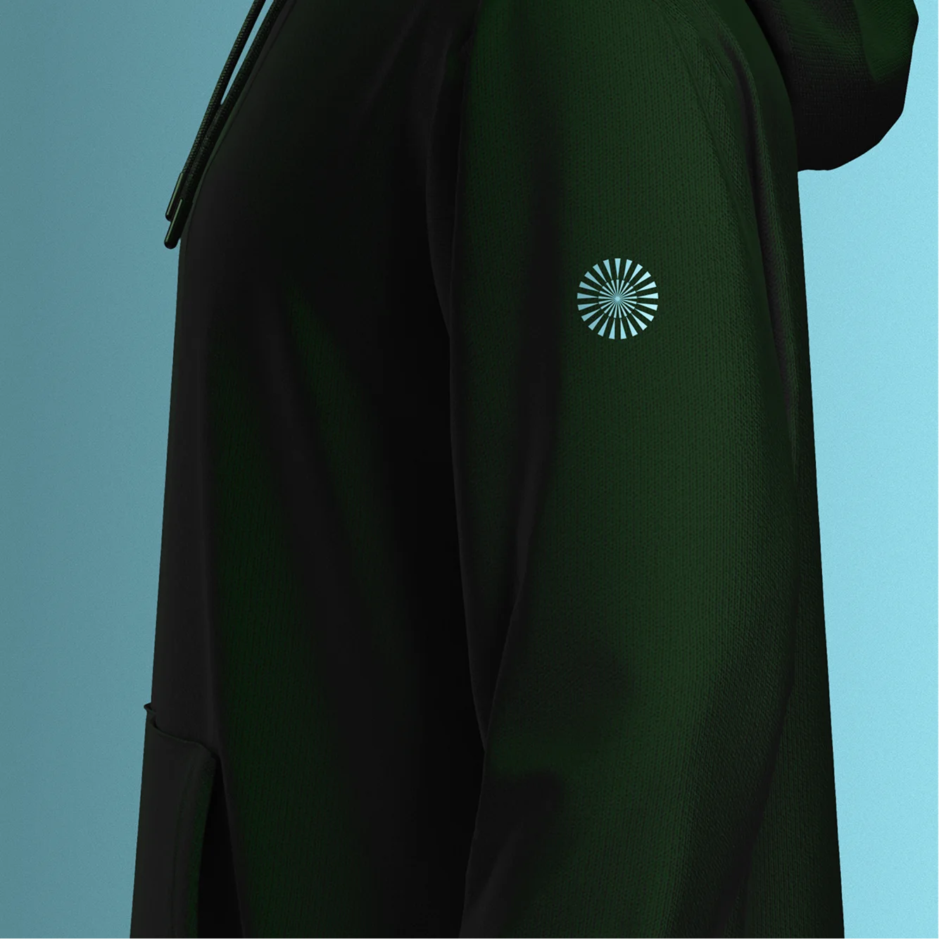
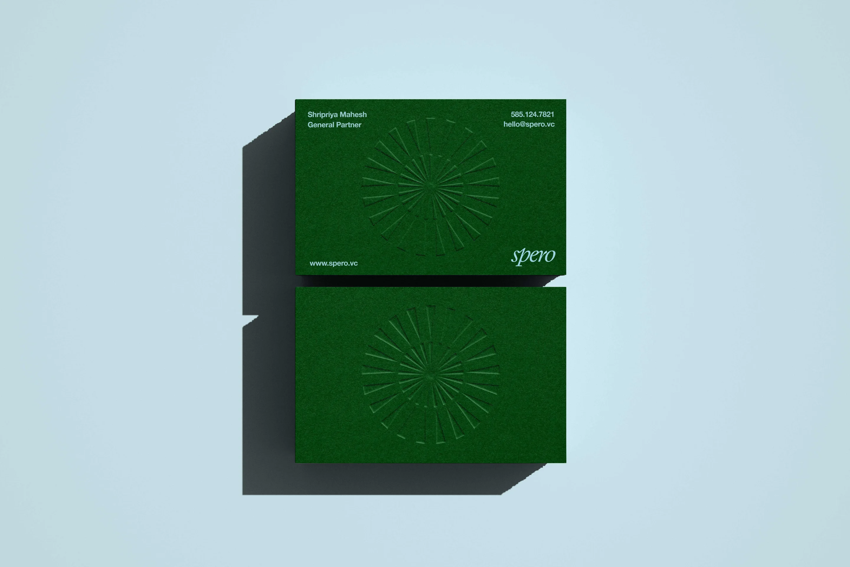
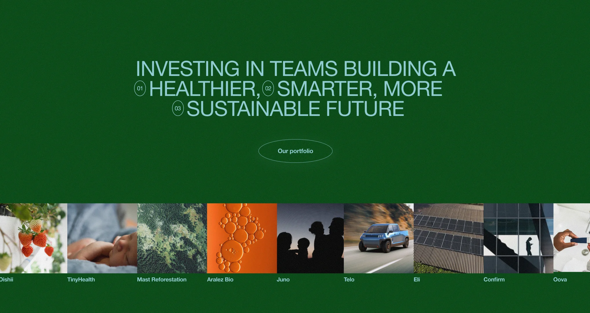
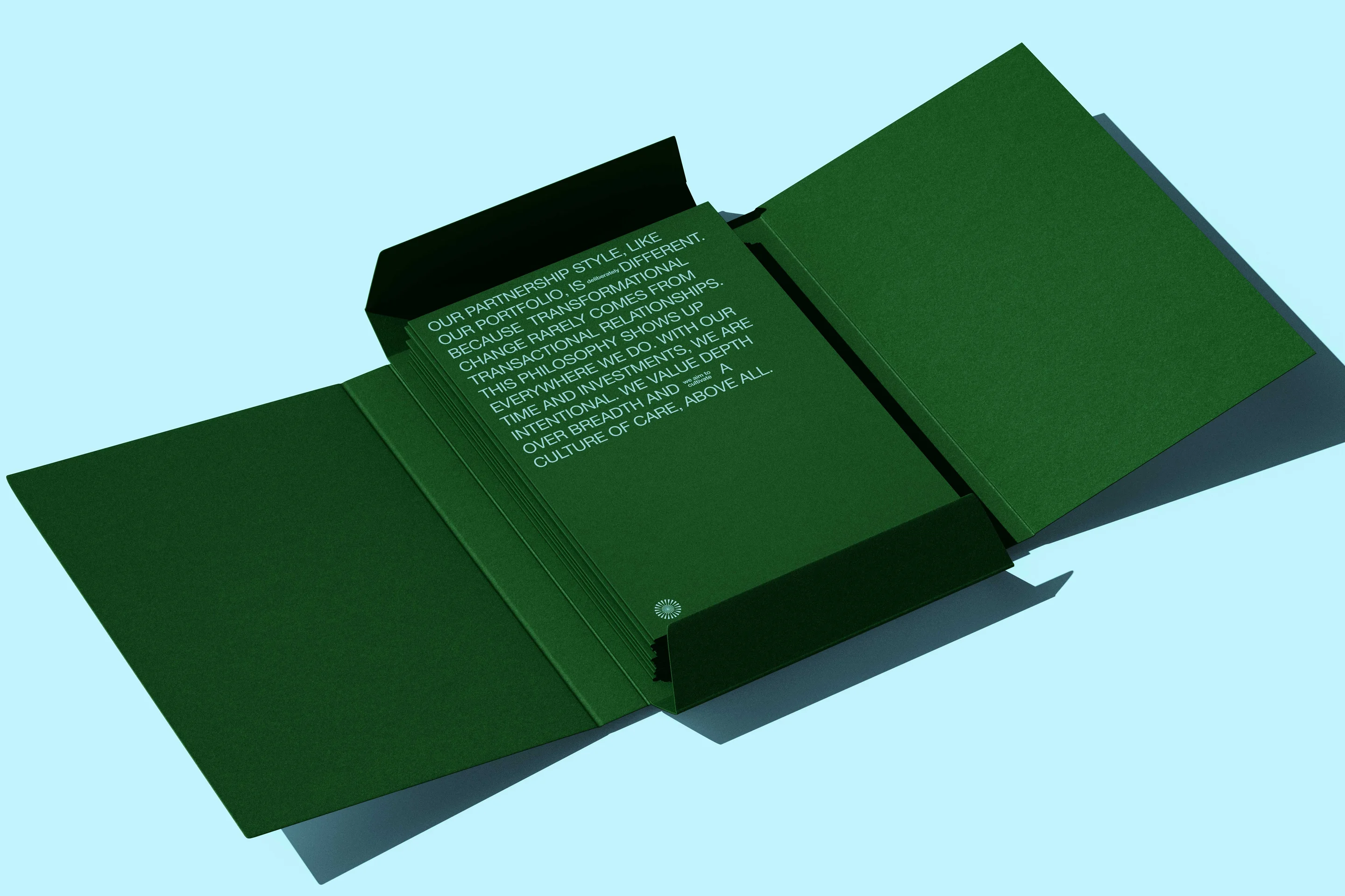
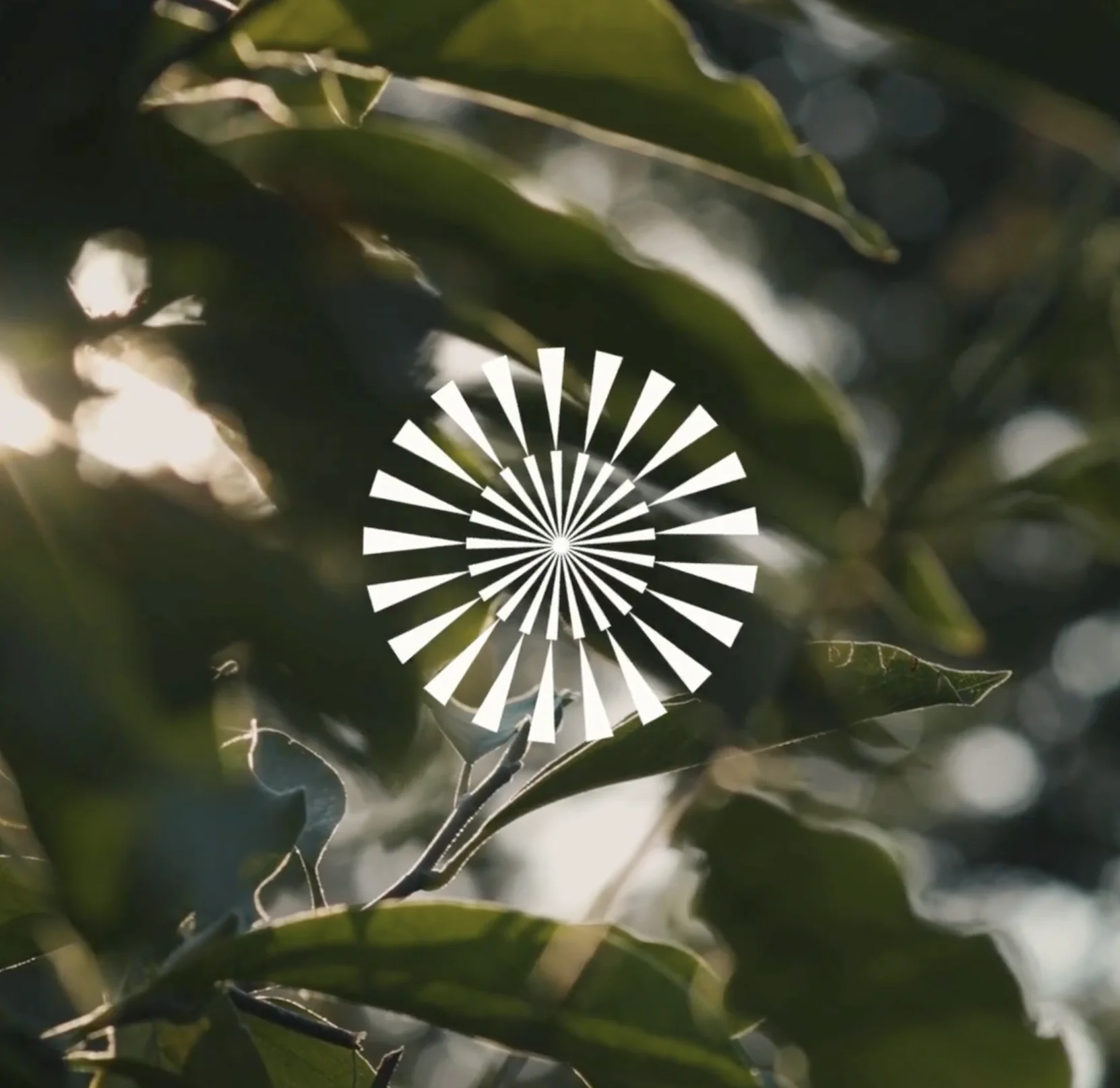
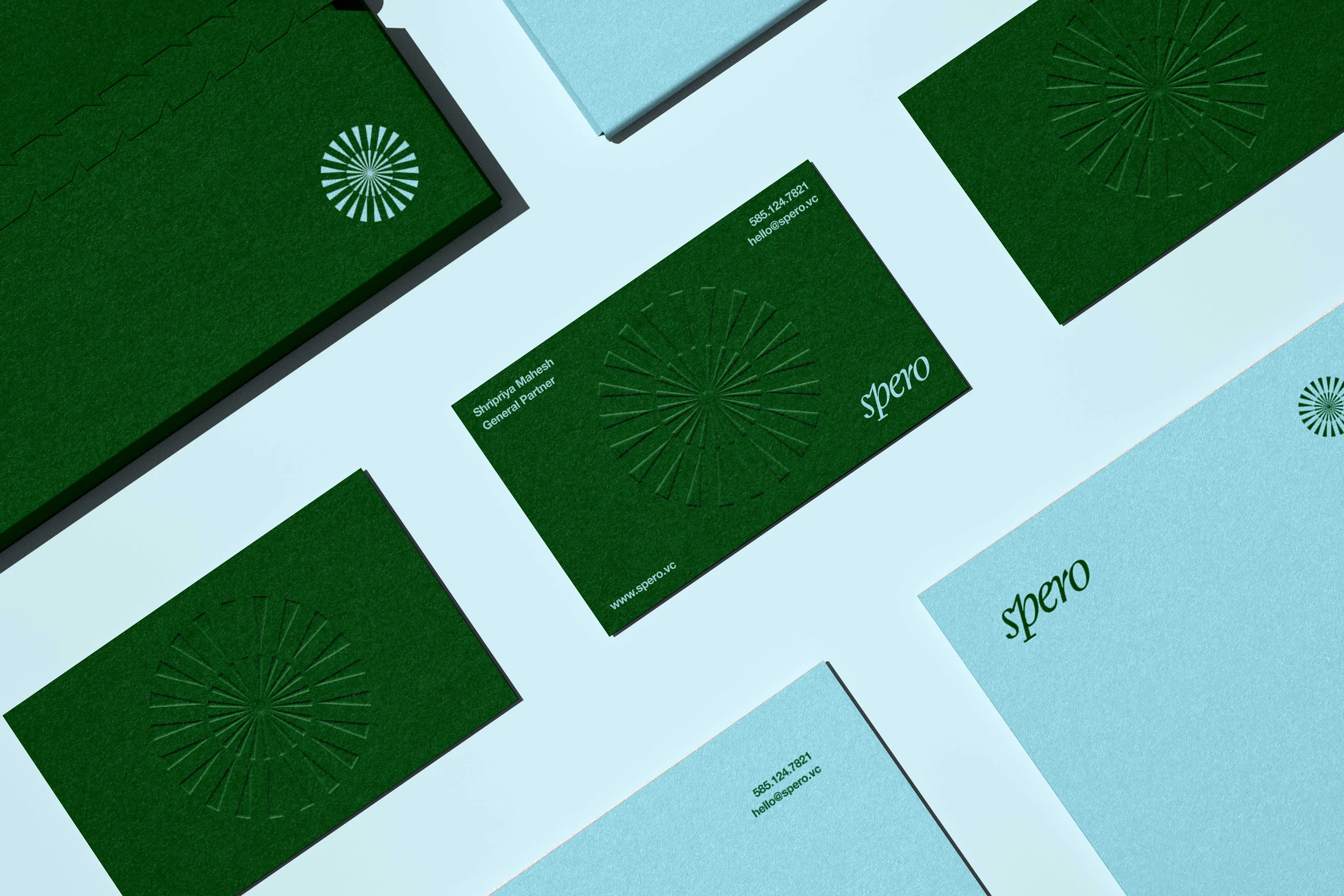
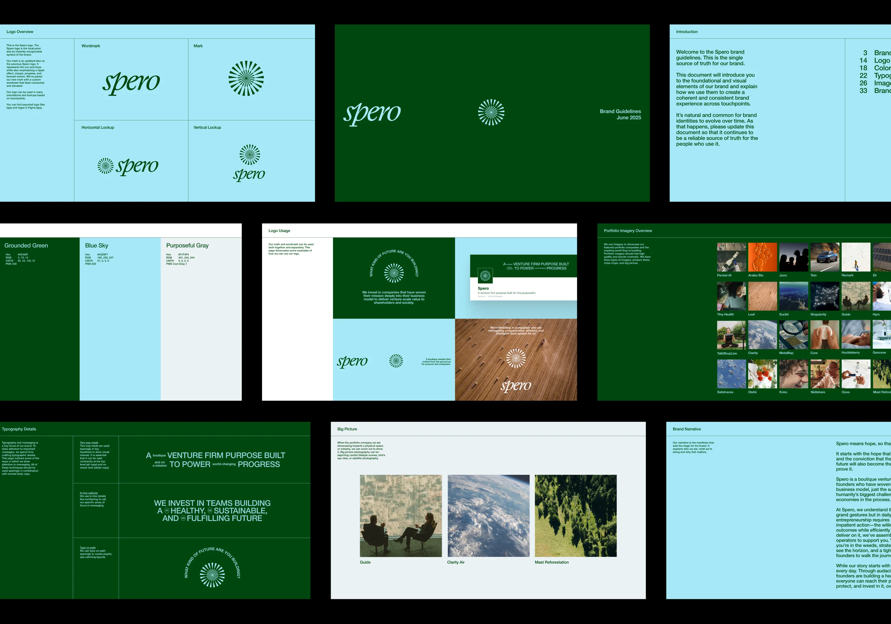
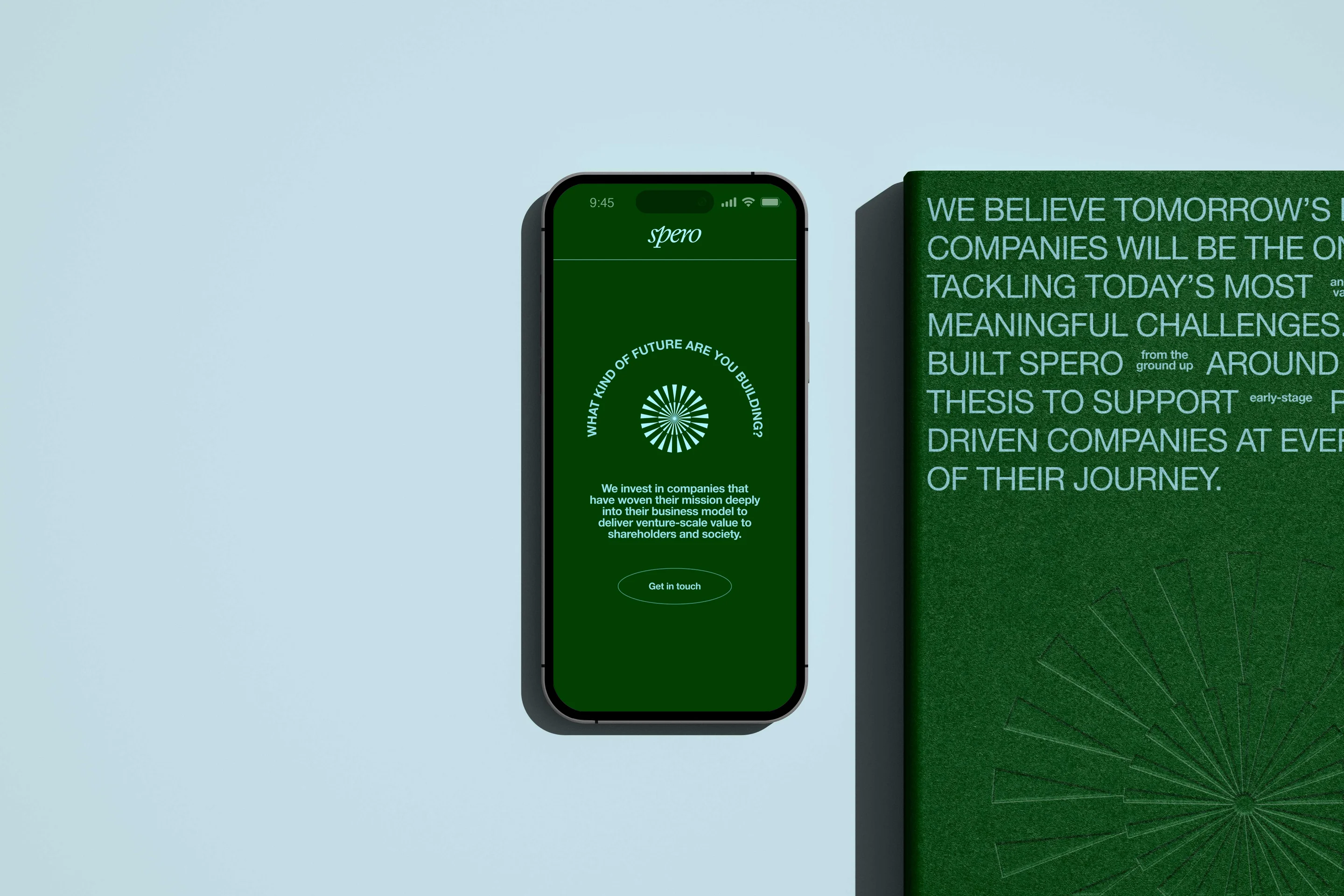
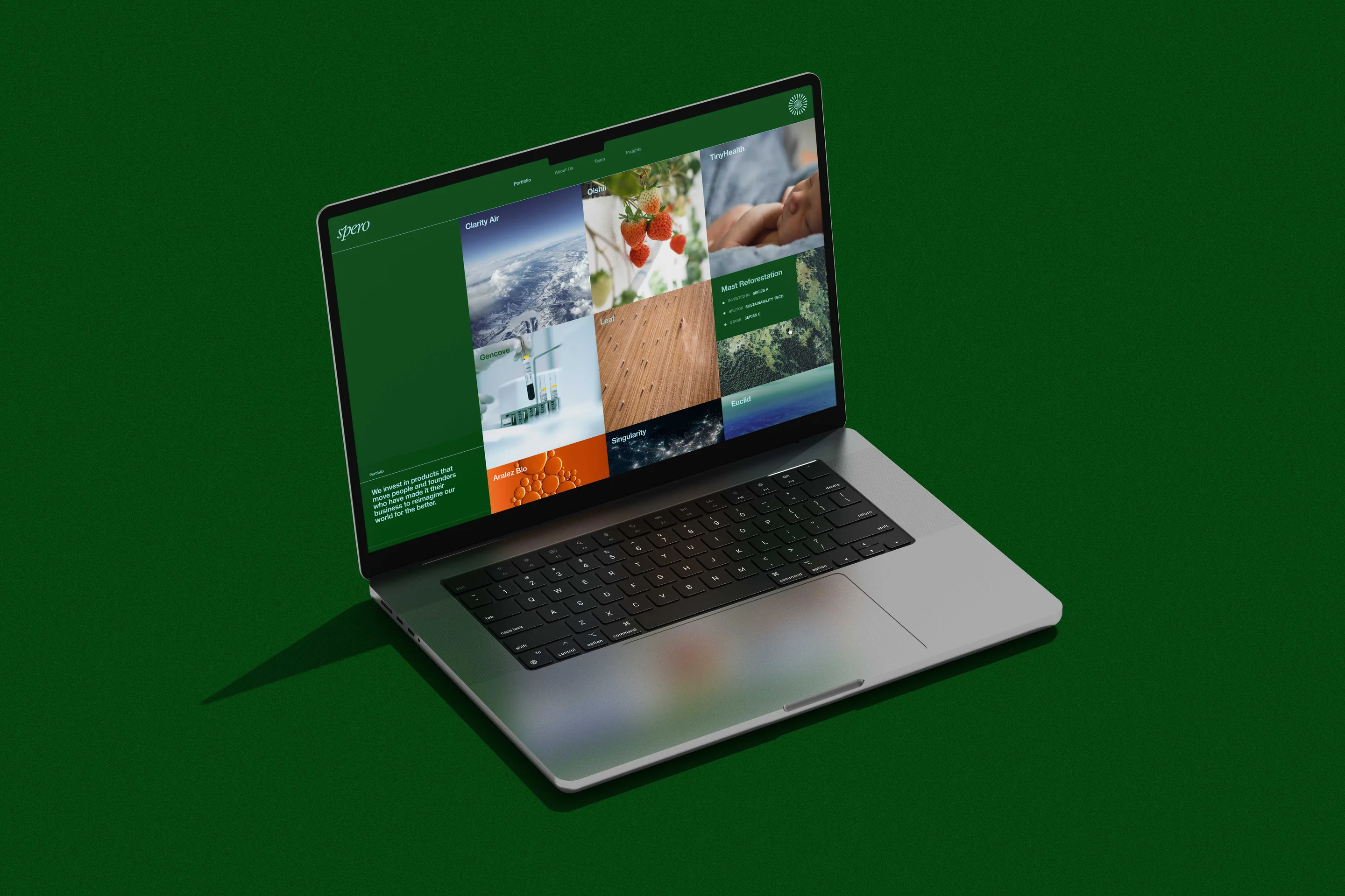
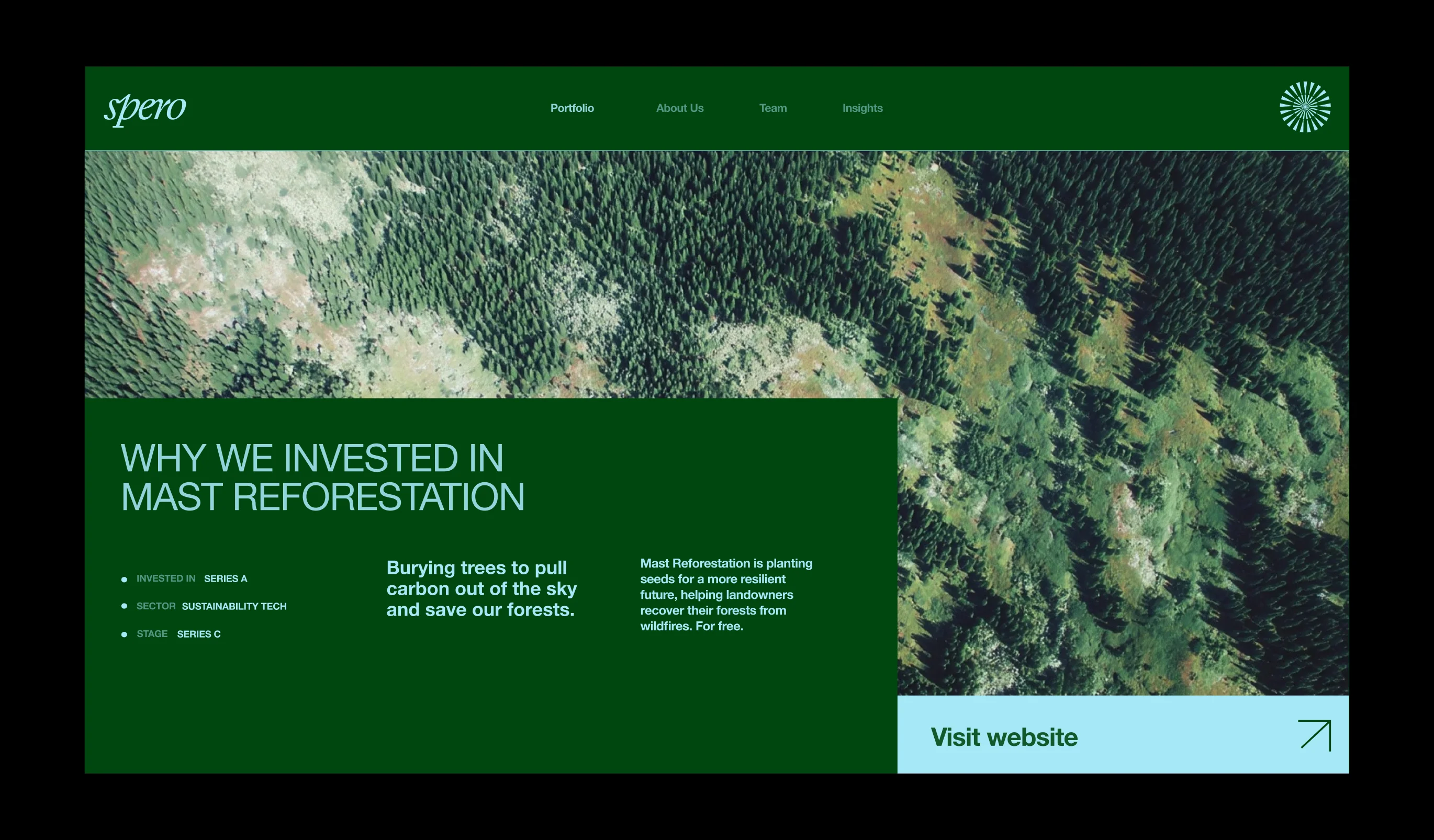
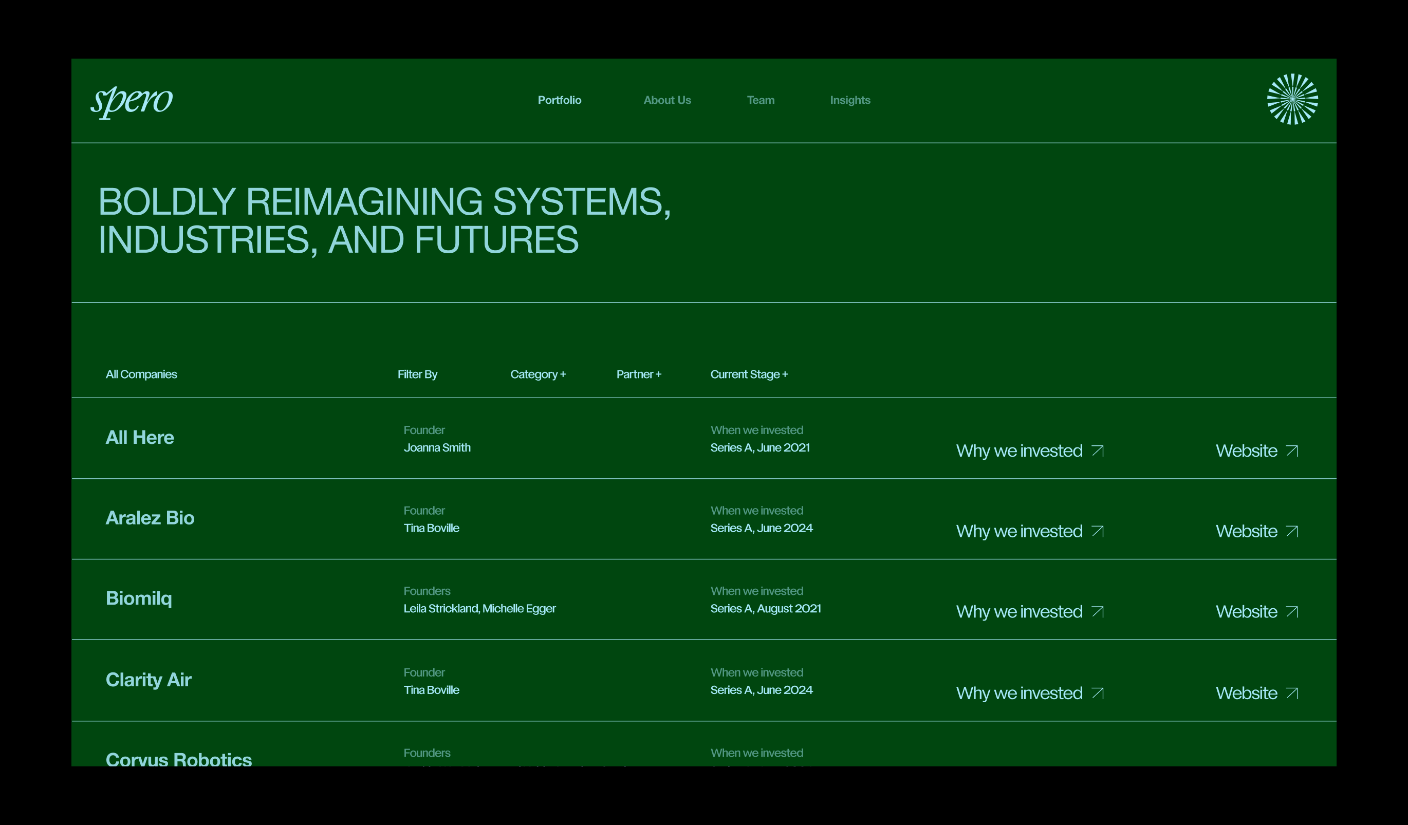
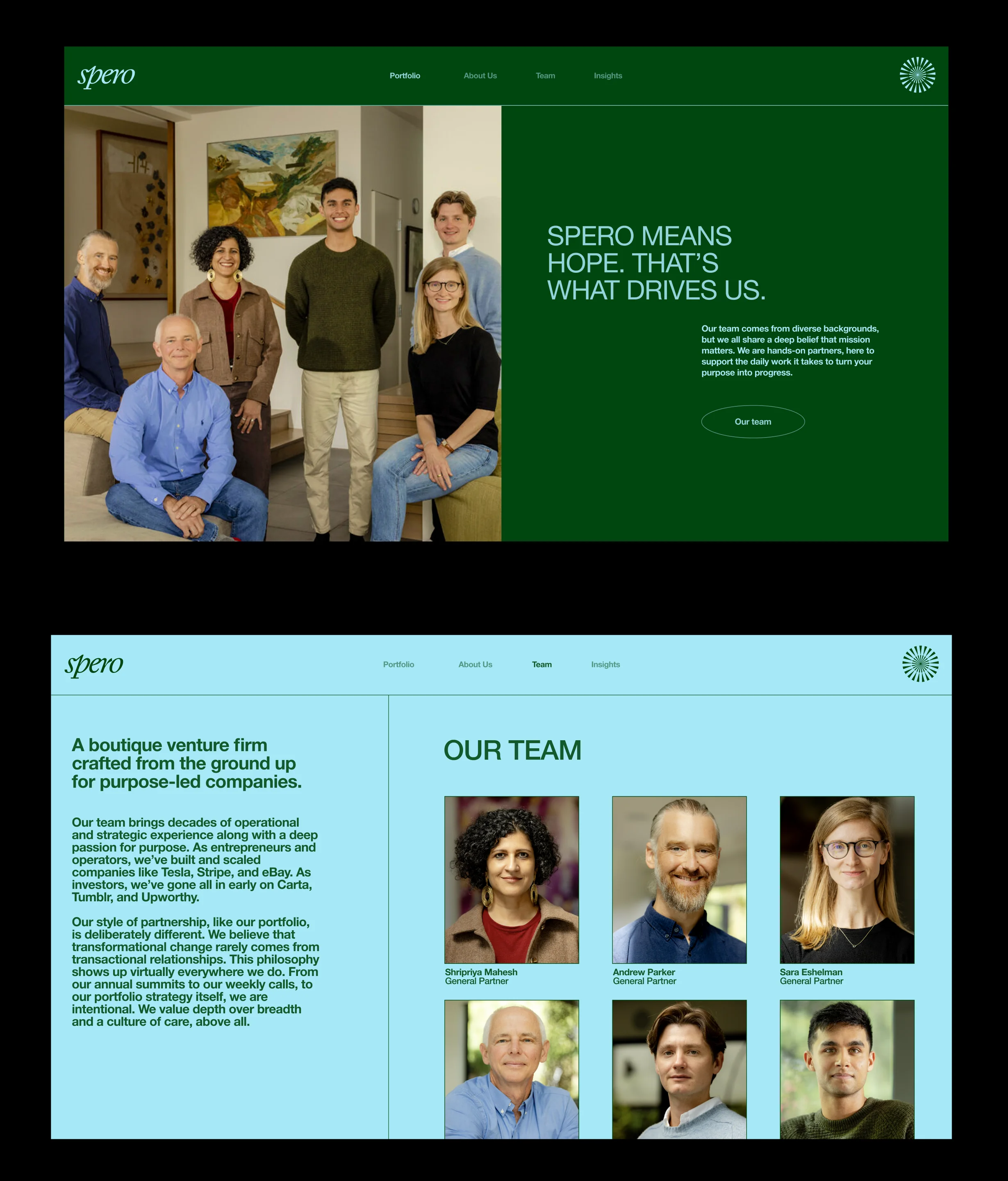
Our brand identity makes our strategy visible. We developed a logo full of symbolism: a compass to represent purpose, a wheel for turning, and a sun to reinforce hope—Spero is Latin for hope, after all. We used micro and satellite photography to showcase our portfolio companies and nod, again, to the idea of big vision paired with on-the-ground details. Our type system does just the same, emphasizing big, bold messages with moments of detail in between.

“Goodside is incredible. They spent time to really understand who we are and what we do. They were able to translate that into a brand that is inspiring and conveys what we want to accomplish in the world. Each week, the progress and the creativity were incredible to see. They stayed involved through the launch and were so responsive and helpful. The end result is something we're really excited about.”