& Radial Health
Goodside is an independent brand design studio creating identities for the products, places, and experiences people fall in love with.
For business inquiries,
collaborations or hellos

Follow along
Instagram LinkedIn X (Twitter) Substack
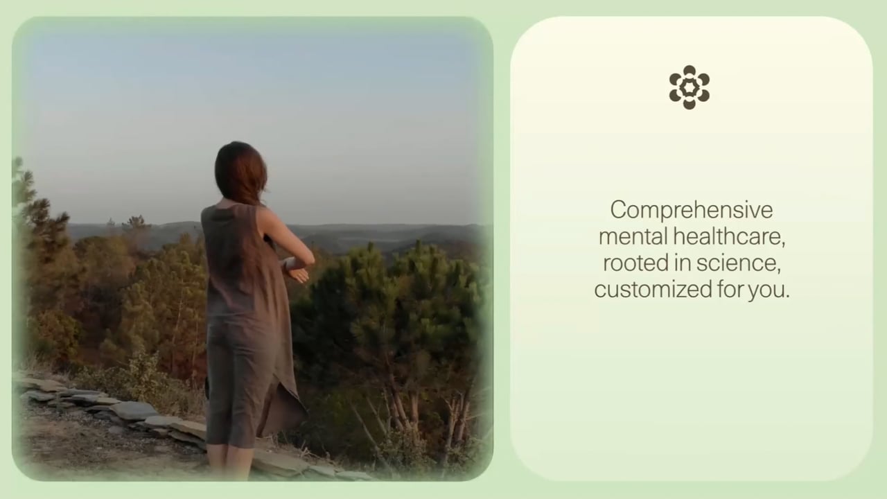
To truly understand and treat mental health, we can’t just look at the symptoms. We have to go deeper. When we talked to patients and providers, we heard a common theme that applied equally to individual experiences and the system as a whole: transformation comes from within. This became our conceptual anchor for the brand.
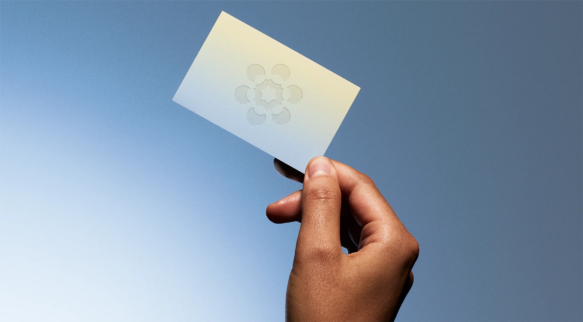
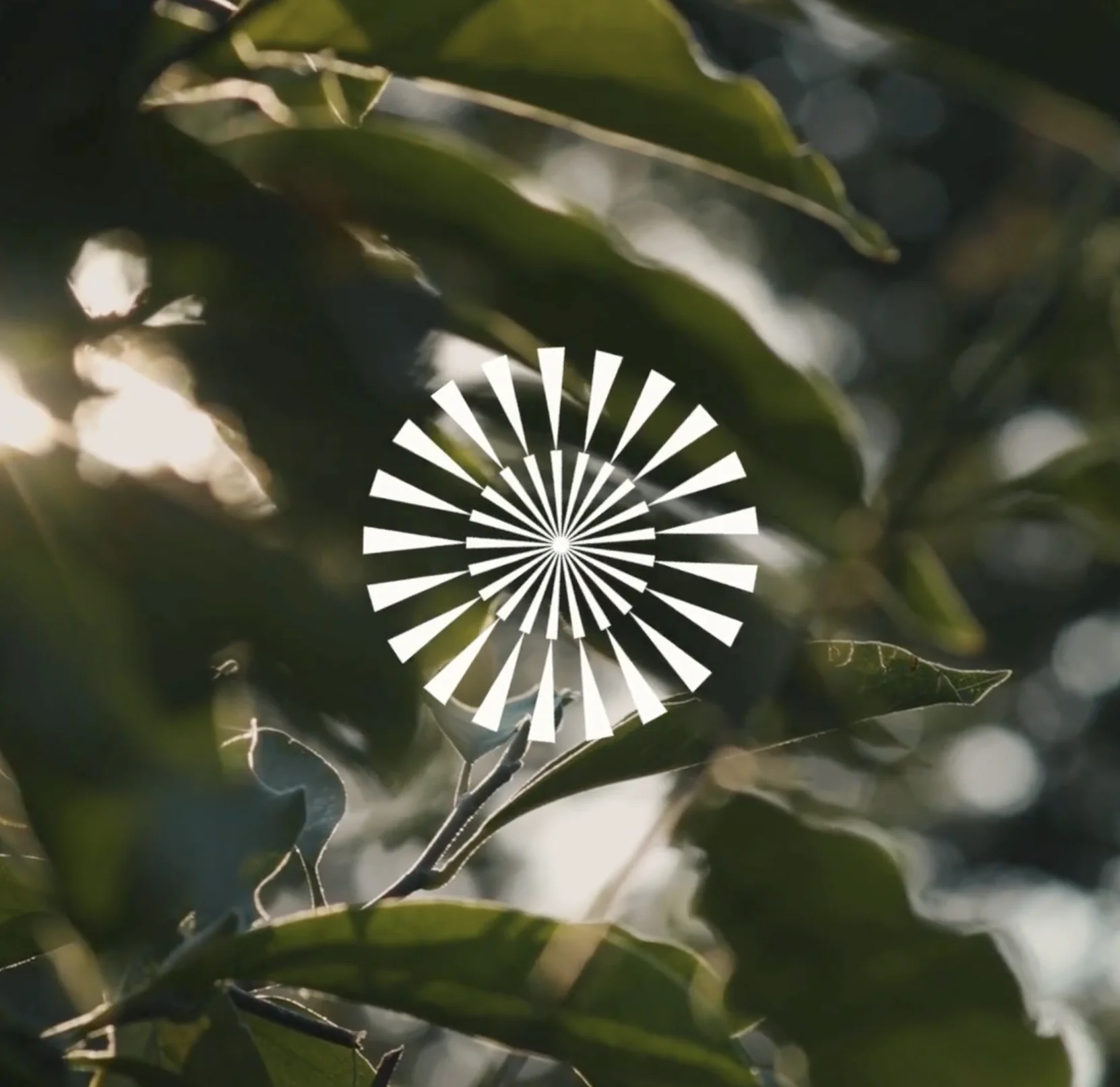
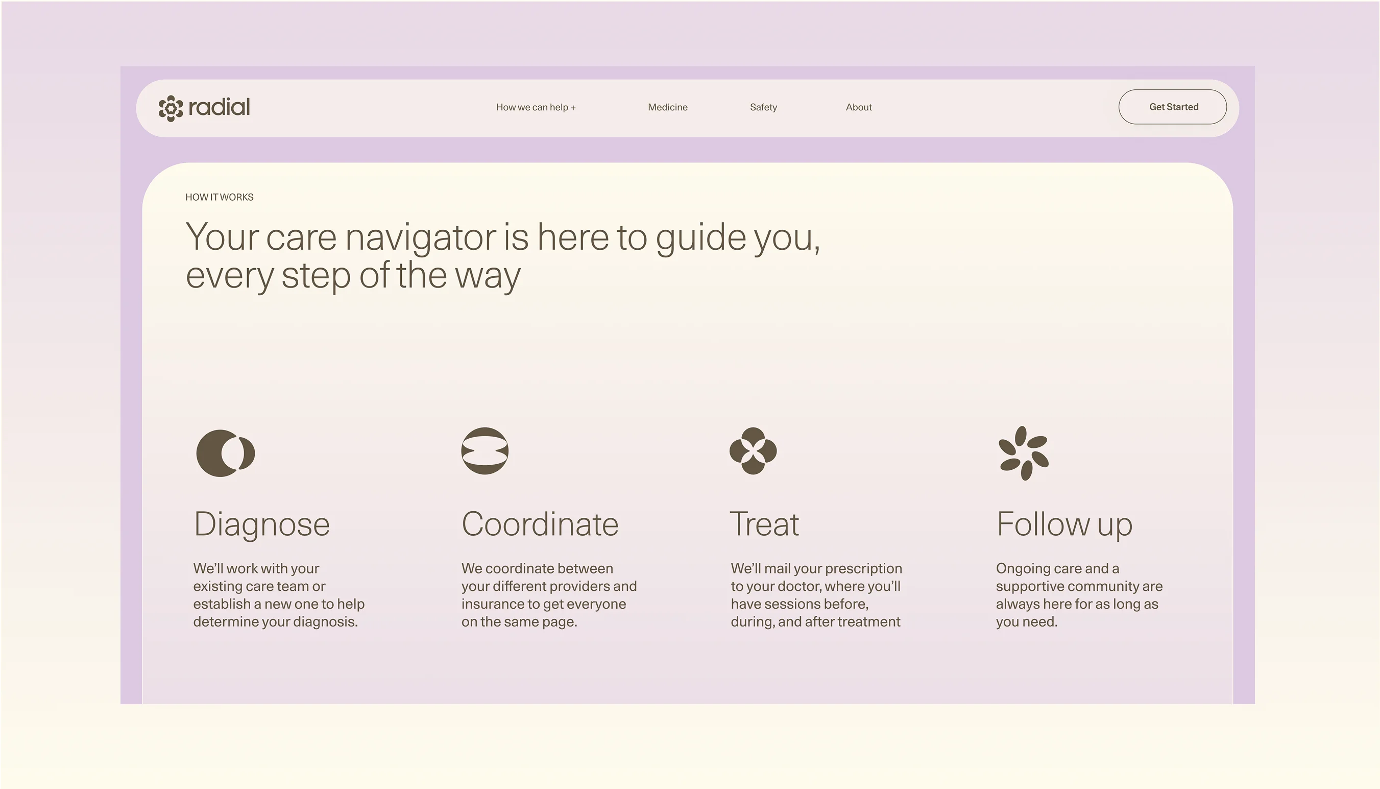
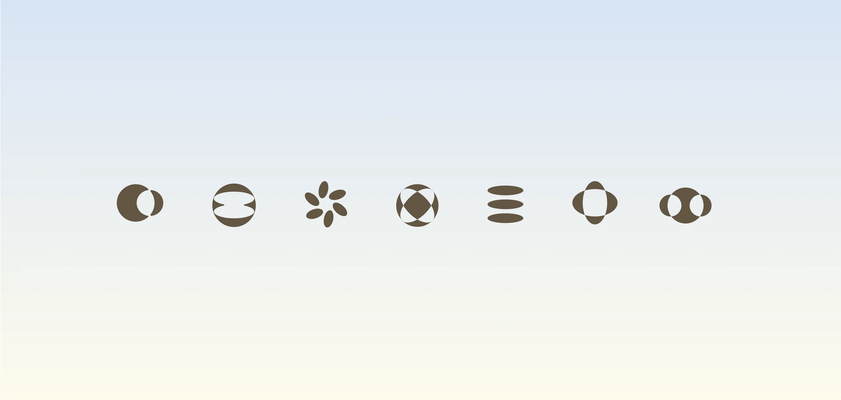
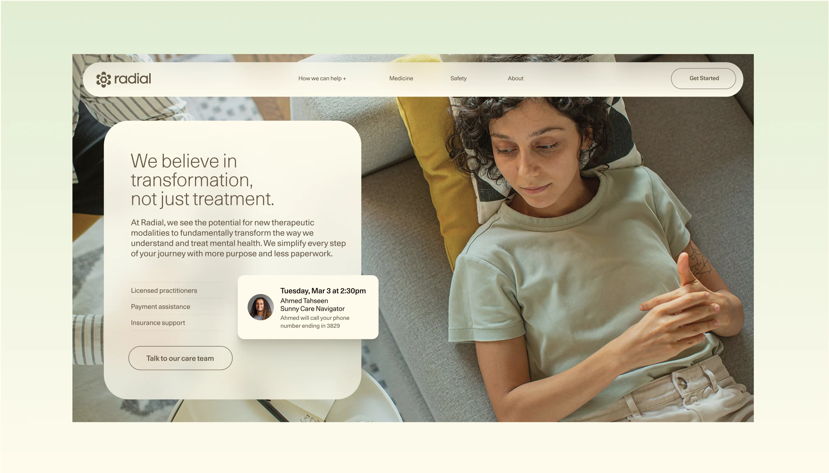
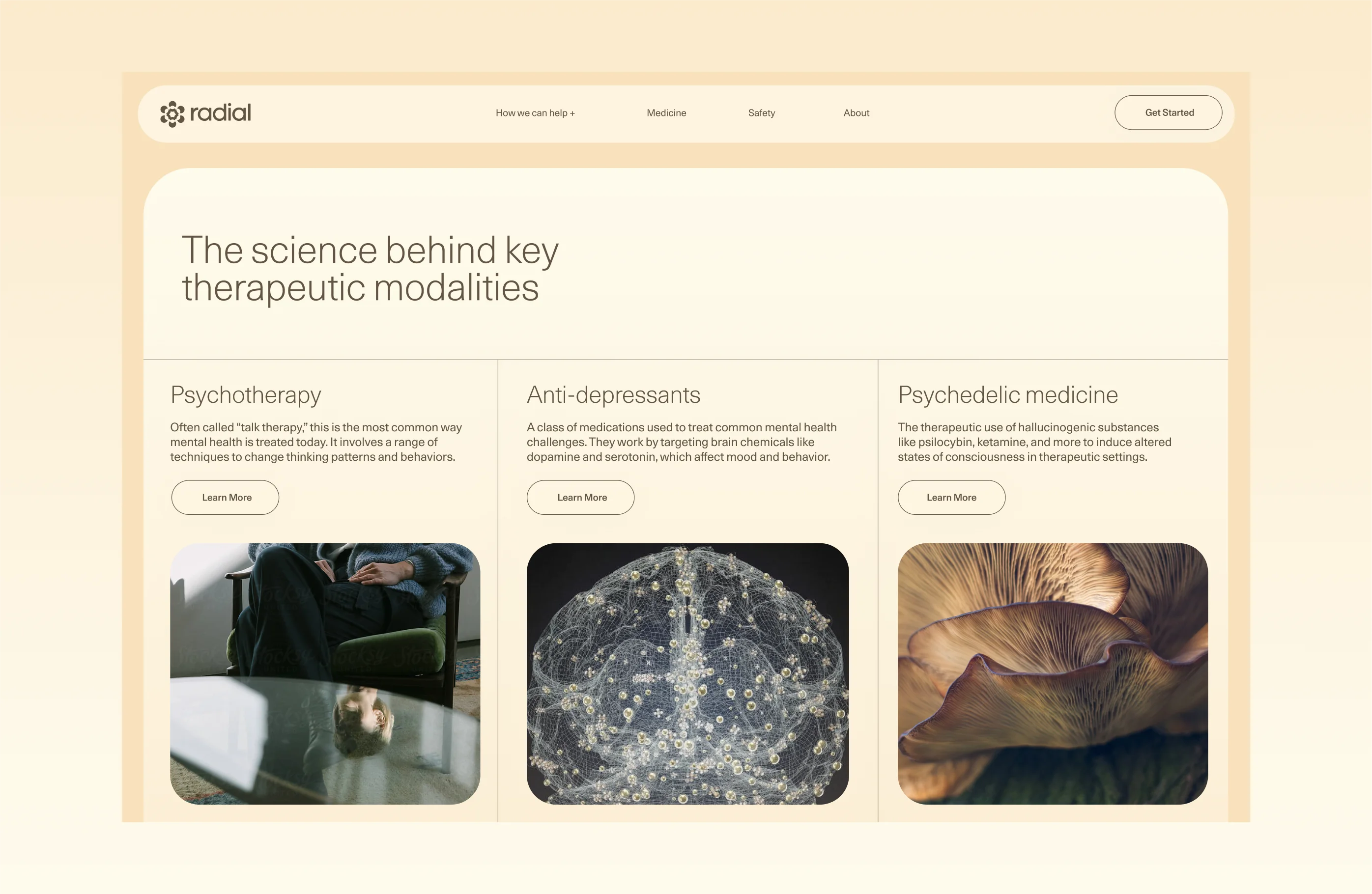
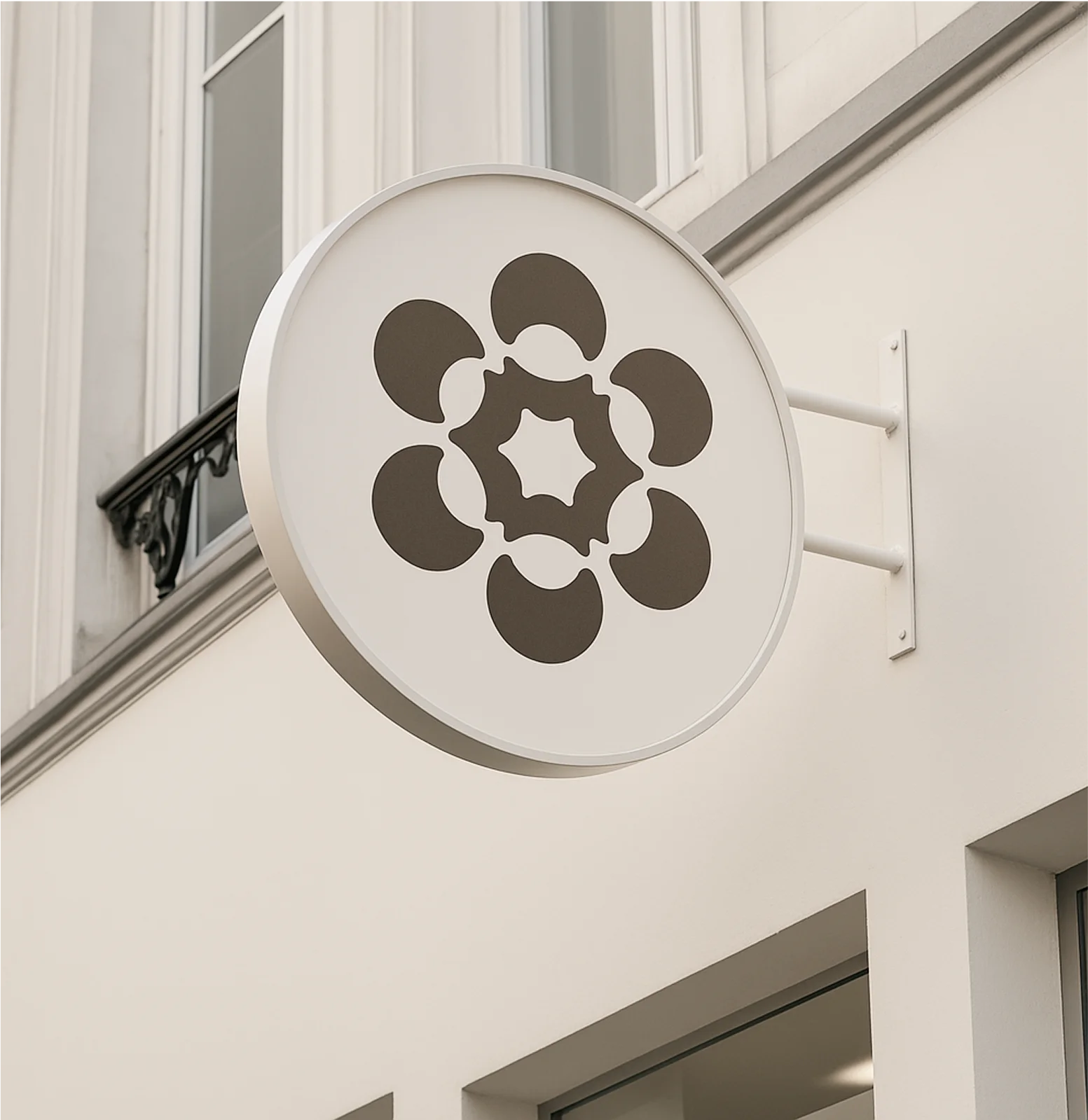
When we started the project, the team was known by the cheerful name, Sunny. While we all appreciated its warmth and optimism, patients told us it felt a bit problematically positive—mental health isn’t always sunny, after all. Our new name, Radial Health, struck a better balance with a tie to our core brand idea. From there, we designed a logo with layers of meaning: a kaleidoscopic unfolding, a blossoming flower, a gathering group, a movement in the making.
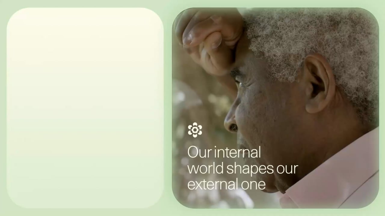
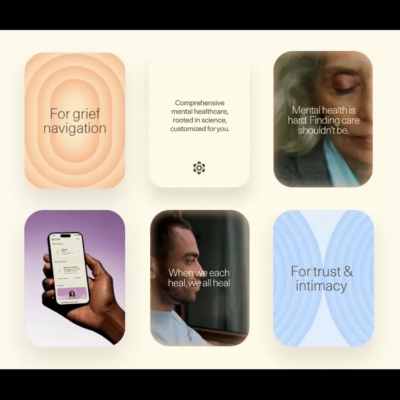
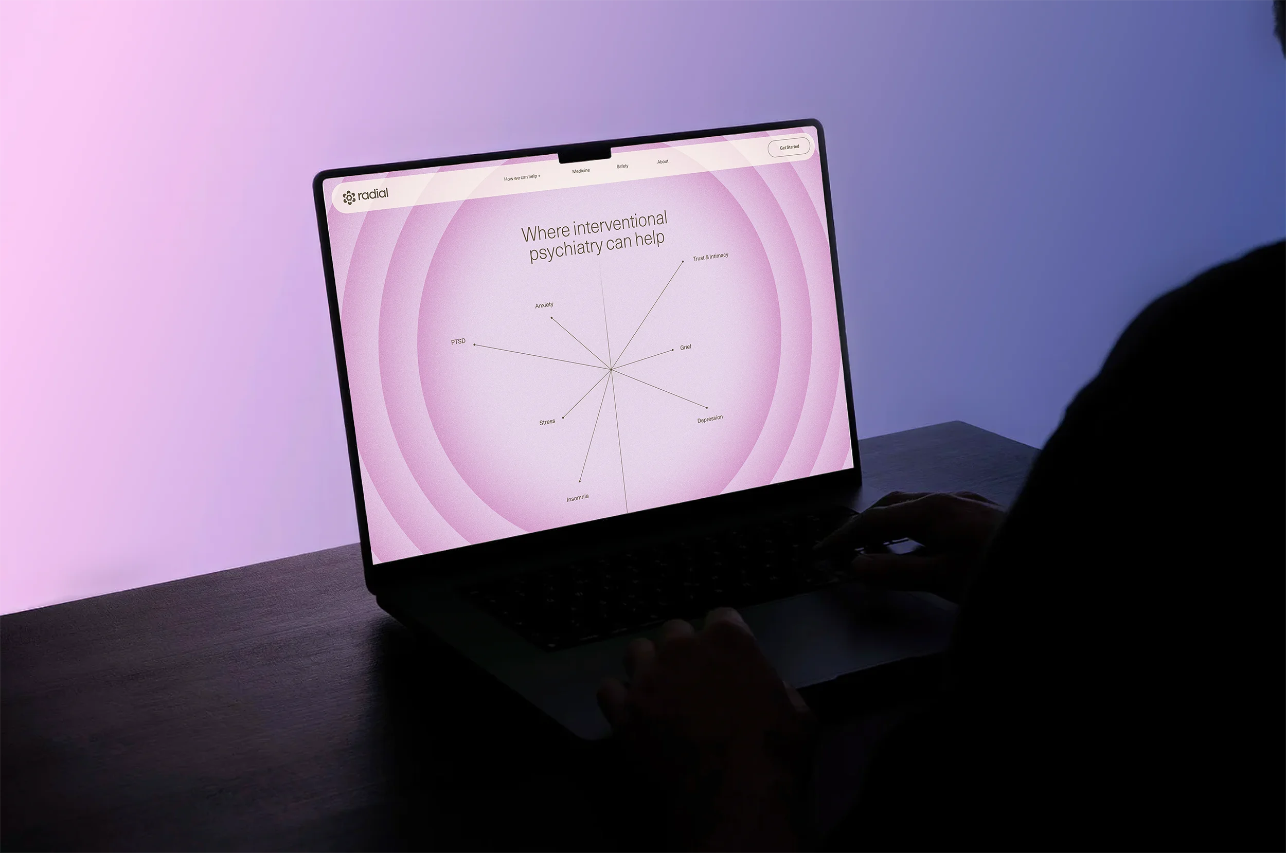
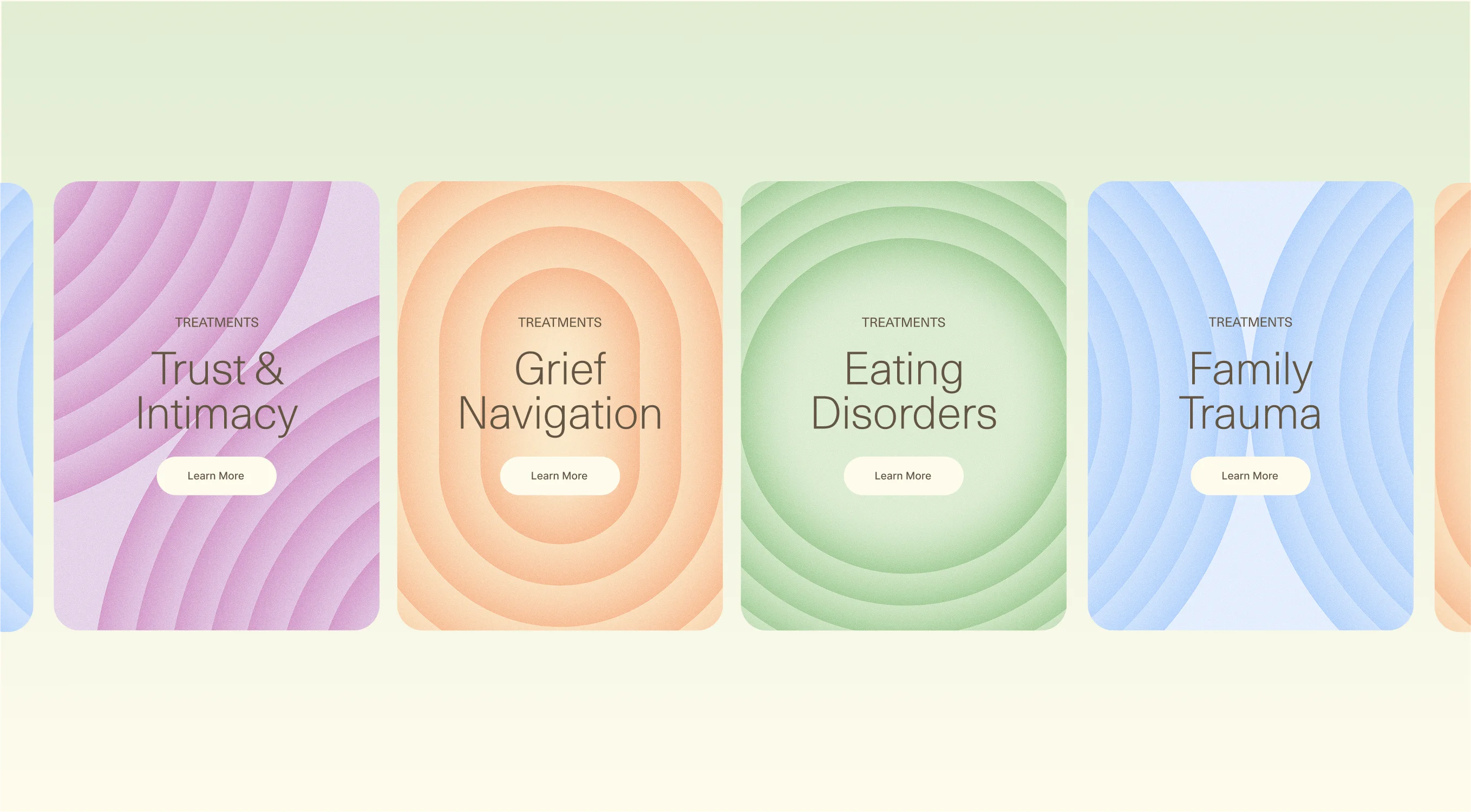
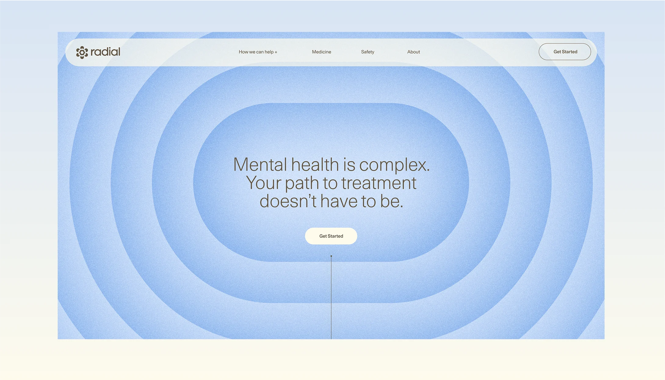
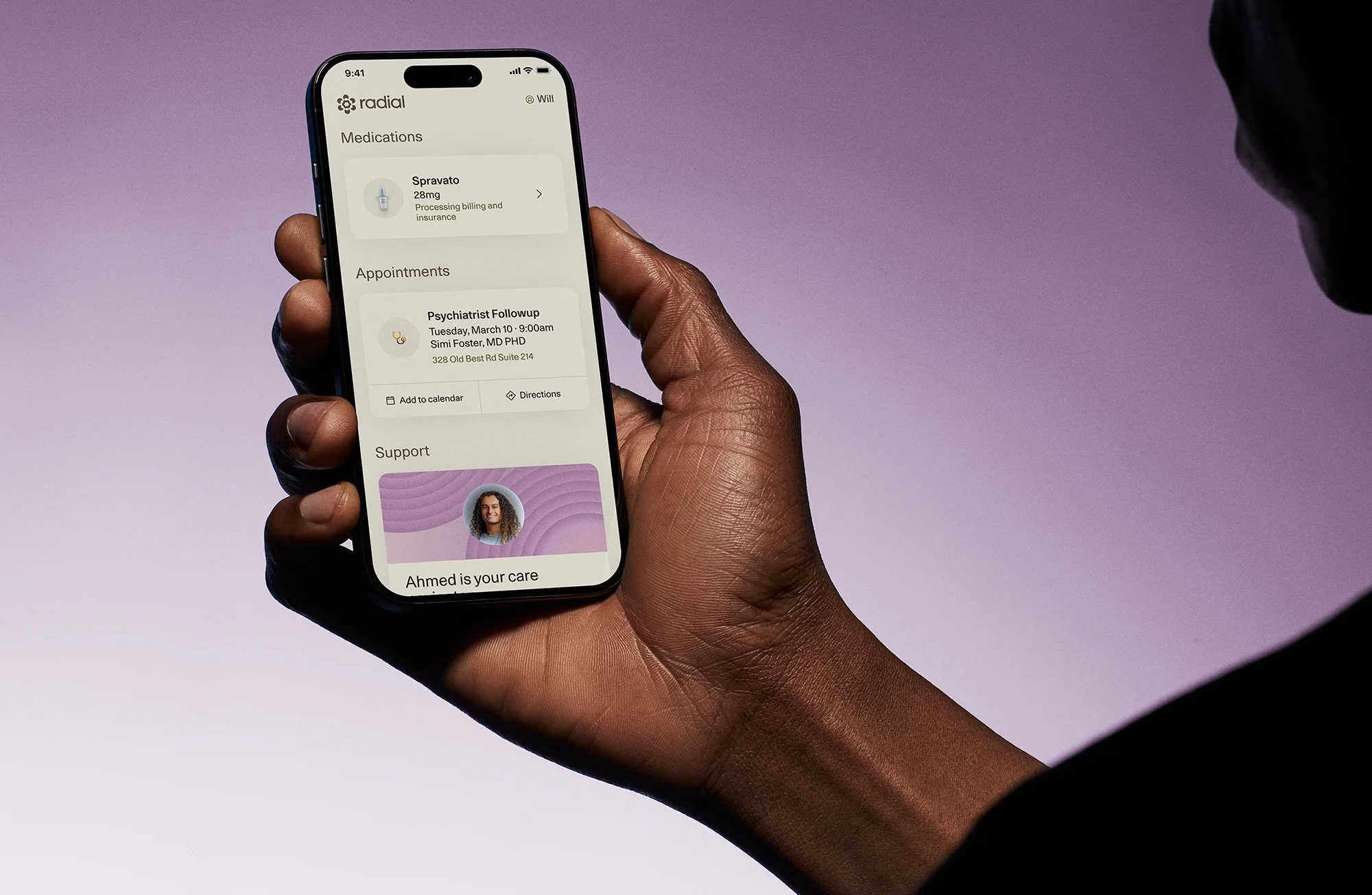
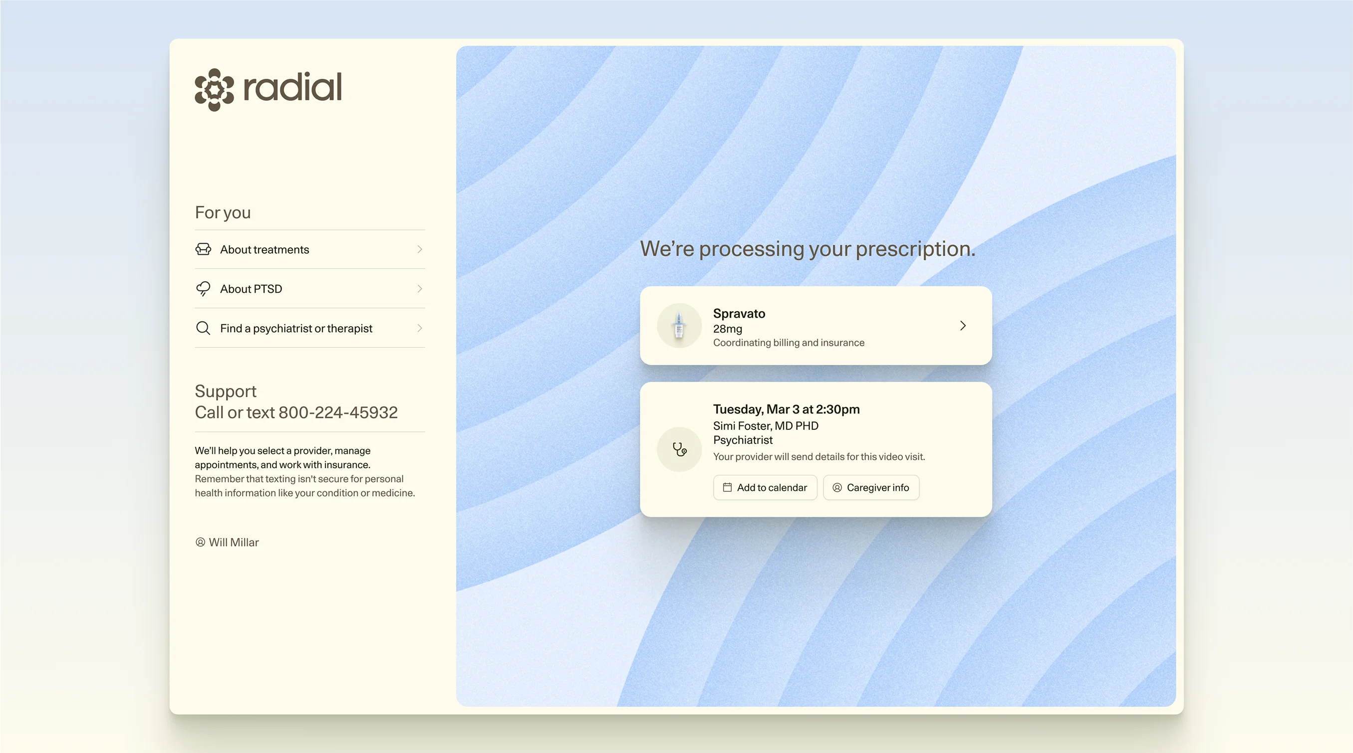
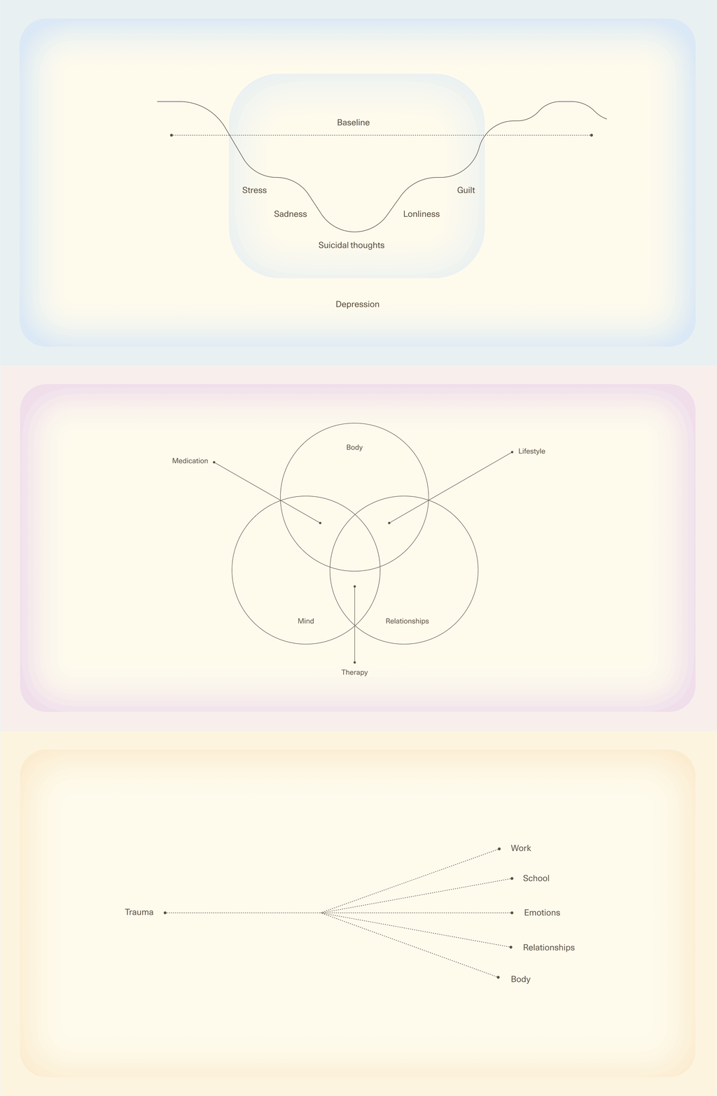
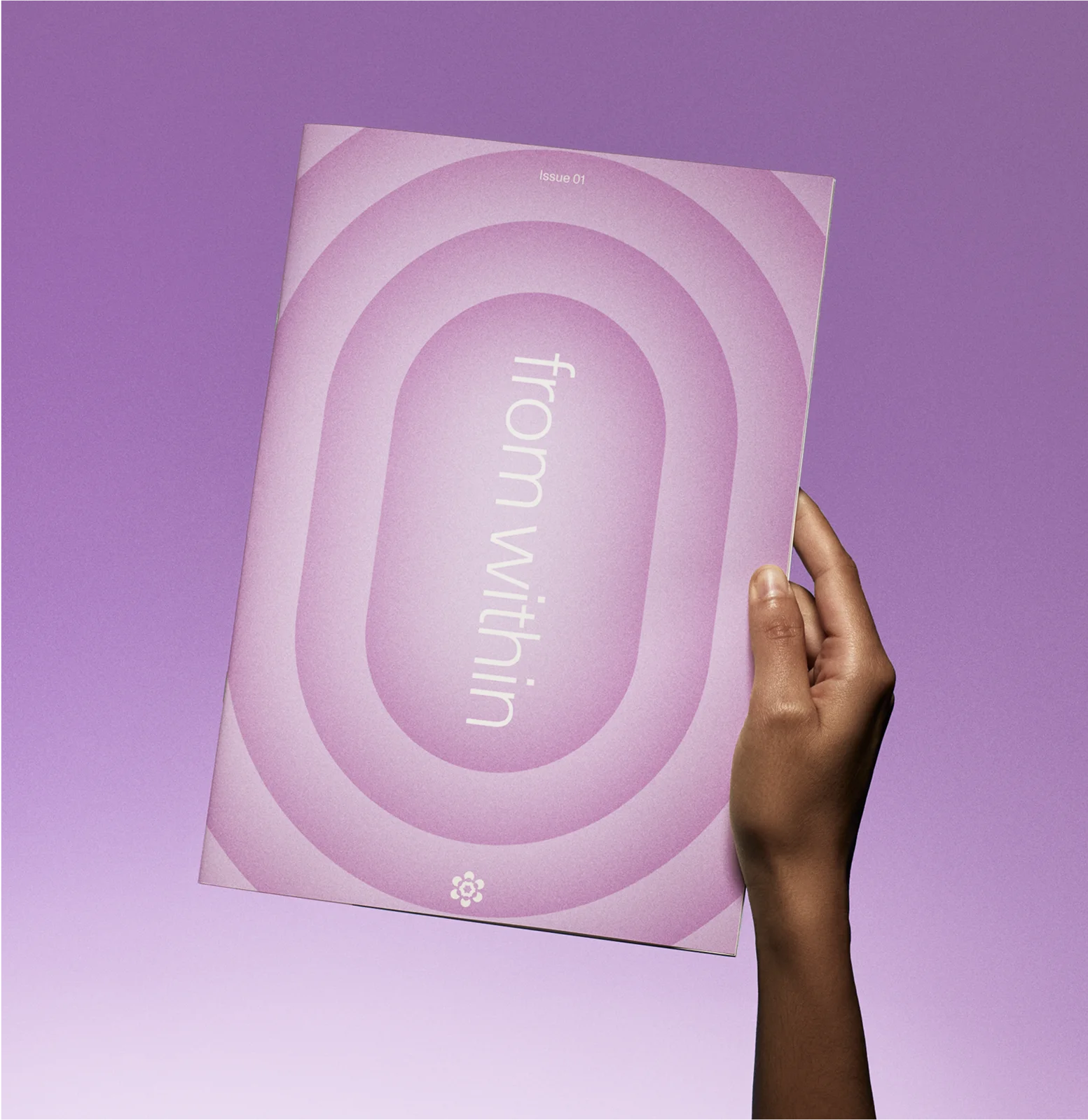
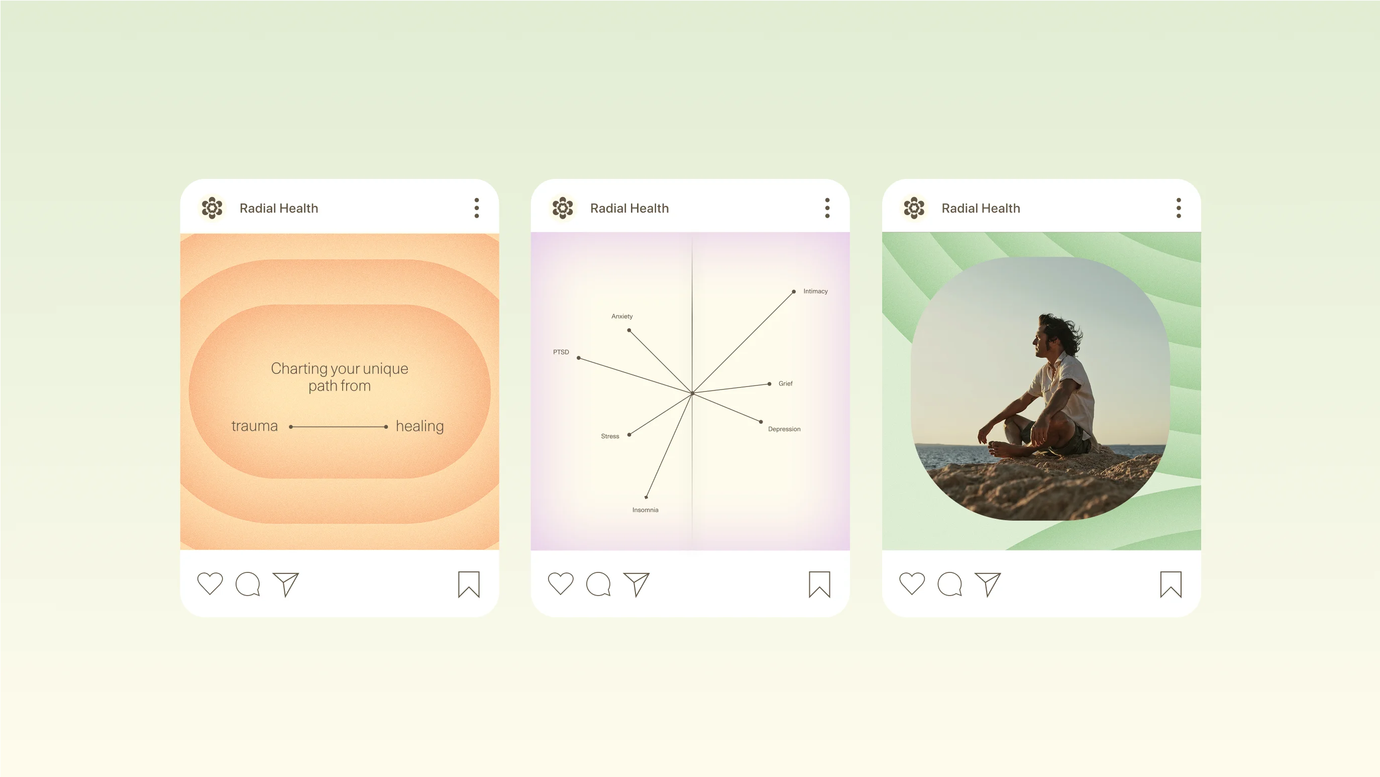
Our new name practically demanded that we explore visuals that reverberated from their core, and we were happy to do just that. We drew inspiration from meditative labyrinths and ripple effects, creating recognizable patterns that became the brand’s central motif. A near-pastel palette further created a sense of calm while linear elements lend a scientific, technical credibility to the important work happening here.
“Partnering with Goodside was both an absolute joy and the best decision for our fledgling company's brand!”
“Goodside was without a doubt the most exceptional, detail-oriented, quick, and high-quality group I've had the pleasure of working with.”